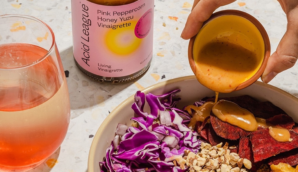
A lifetime of getting hammered by thousands of ads a day, has turned us all into shockingly efficient judges of brand quality.
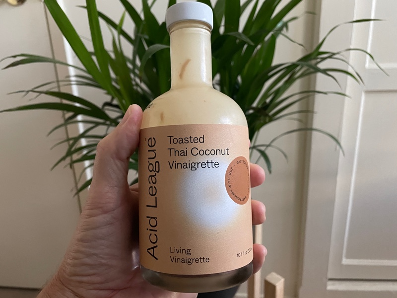
I saw this superpower in action recently after buying a bottle of Acid League salad dressing.
I showed the bottle to my wife because I thought she might like it.
Our 12-year-old son who sat nearby saw the bottle, too. A split second after seeing it he said, “Whoa, that looks expensive!”
Now keep in mind, while he does eat leafy vegetables almost every day, he never uses salad dressing. He’s definitely never shopped for dressing or spent any time comparing brands.
Yet, he had this clear, instant assessment of the product.
As a brand strategy and research nerd, I had to ask him why he thought that.
It was tricky to articulate.
For him, there was just something about the mix of colors, imagery, and typography (“the text” in his words). My wife added that the style of the bottle felt more expensive, too.
And it’s true. In terms of product quality and price point (around $7) this was a premium bottle of dressing.
The things that jumped out to my wife and son are what caught my eye as well. It stood out alongside the 50+ other brands at the store, many of which looked kind of the same.
Despite the fact that I’ve spent years as a consumer buying and using salad dressing, and my son has spent exactly zero time, we both arrived at the same conclusion. It’s high quality.
The reason my son was able to make that assessment so quickly is due to our natural ability to identify and remember patterns. Any time we see something new, our brain compares it to relevant past experiences. The goal is to help us predict what to expect and decide whether this new thing is worth our energy and attention.
And it happens in a blink of the eye.
For my son, the pattern matching he relied on was mostly related to design.
The Nielsen Norman Group (user experience experts) did a breakdown on how the use of things like typography, space, colors, and content hierarchy make it easier for us to understand and digest brand information.
It’s more pleasing to our brains to see information and content presented in a way that’s simple to consume and understand. And these practices for good, usable design in turn connect to a pattern of premium quality for consumers.
From a brand perspective though there are other factors, too. They’re not all absorbed at first glance, but they all contribute to your brand’s story and positioning around quality.
To break down four categories of patterns and how your brand can tap into them, we can compare Acid League’s bottle against a more generic, mid-quality brand.
Striking Colors And Imagery
Since purchasing that first bottle of dressing from Acid League, I’ve since bought another bottle with one of their other flavors – Pink Peppercorn Honey Yuzu Vinaigrette.
For contrast, we can compare it against a bottle of yogurt-based ranch dressing that we had in the fridge. I obscured the brand name as the point is to dig into how the brand communicates not specifically which brand it is.
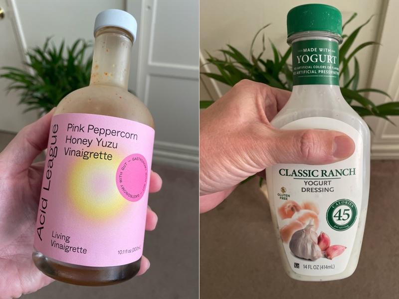
Acid League’s color choices are:
- Unusual – they help catch attention and stand out from other brands
- Modern – the palette feels fresh and of-the-time
- Emotional – the colors connect back to the ingredients but in a heightened way (i.e. pink peppercorn is actually red as opposed to a bright pink color)
The Yogurt Dressing brand’s colors are:
- Safe – white and green are very common colors you see in the salad dressing aisle
- Traditional – the palette feels muted and conservative
- Functional – in a very literal sense, yogurt is white and garden ingredients are often green
In terms of imagery, Acid League has very little. They use a soft, abstract circle shape which is bright and helps create contrast with the messaging.
The Yogurt Dressing brand is again very literal. They focus on a primary image of garlic along with some soft, oddly faded onions to fill the available space.
These elements connect back to patterns that reveal details of each brand’s quality.
Acid League’s unique palette creates a feeling that the product is special and high quality. The open design is easy to consume visually and reflects a less-is-more style that matches patterns of other premium brands.
The Yogurt Dressing brand’s choices all feels functional and familiar. It’s patterns tell a story that matches lots of other mid-to-low budget brands. That doesn’t mean it’s bad, it just associates it with a particular category and price point.
Questions to consider for your own brand’s colors and imagery:
- How does your color palette compare with others in your category – does it stand out in any way?
- Do your colors feel modern and unique, or more traditional and possibly even outdated?
- Can your use of color help support the emotional story your brand tells?
- What mix of images would help convey both the functional and emotional benefits your brand provides?
- Are the images you use generic and safe, or are they specific to your brand?
- What opportunities exist to use patterns from other industries that could help tell a more compelling story in your space?
Refined Typography
As discussed in the Nielsen Norman Group article above, there are a lot of factors that go into creating typography that’s aesthetically attractive and functionally easy to consume.
Everything from the choice of typefaces, to the space between lines (i.e. leading) and space between characters (i.e. kerning) all contribute to patterns we associate with quality.
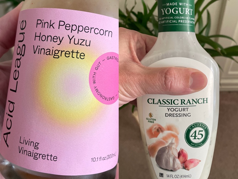
Acid League’s typography is:
- Clean – their thin, sans serif typeface feels very modern
- Spacious – the lines of text and characters have plenty of room to breath
- Consistent – only about 5 slight font variations exist on the front label
The Yogurt Dressing’s typography is:
- Classic – the dominant serif typeface has a traditional feel
- Condensed – the leading and kerning are both tight to help fit more content on the label
- Varied – looking at variance of color, size, and typeface there are around 10 font variations visible on the front label
Once again, we can see how each brand’s characteristics align with identifiable patterns.
Acid league’s restrained choices and open feel make the text easier to consume and fit with premium quality patterns.
The Yogurt Dressing’s wide variance of fonts and more classic approach tell a story of a brand that is less refined and sits somewhere in the middle.
Questions to consider for your own brand’s typography:
- What typefaces best align with the value your customers are seeking?
- Is your brand better served by leaning into a modern aesthetic or a classic one?
- Can you utilize open and consistent design patterns to improve your design quality?
Specific And Unique Features
The strength of any brand’s story of quality depends heavily on the individual features of its offering.
For a food product, the ingredients are the most critical features. And there are a wide range of factors to consider with them. Everything from an ingredient’s flavor, whether it’s natural, how rare it is, and how it’s sourced all contribute to its perceived quality.
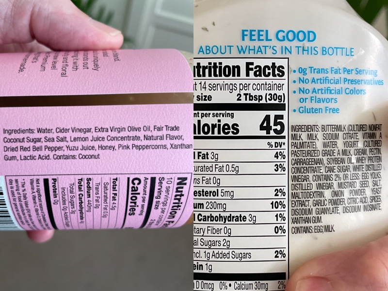
Acid League’s ingredient features are:
- Unusual – there are several standout ingredients here including Yuzu Juice, Pink Peppercorn, Dried Red Bell Pepper, and Coconut Sugar
- Ethical – they make a point, at least with the Coconut Sugar, to note that they uphold Fair Trade standards
- Clear – everything on their list, with the possible exception of Xanthan Gum (a common food thickener) are food items you can recognize and understand
The Yogurt Dressing’s ingredient features are:
- Standard – there’s nothing in their list that qualifies as unique or special
- Safe – they make a note of there being no artificial preservatives, colors, or flavors which speaks to a general level of quality
- Mixed – along with plenty of normal food ingredients there’s the standard dose of hard-to-pronounce additives like disodium guanylate, associated with mass-processed food products
Overall, the Yogurt Dressing’s generic, standard patterns tell a story of average quality.
Acid League on the other hand is able to highlight its ingredients and use them as a key selling point within their premium quality story. Because Yuzu and Pink Peppercorns are unusual, it creates a feeling of exclusivity around the flavor combination.
Another point from a feature perspective are the bottles each brand uses. Acid League’s unusual, glass shape serves as another point of distinction while the Yogurt Dressing’s plastic squeeze bottle feels functional but cheap.
Questions to consider for your own brand’s features:
- What features of your offering are the most noteworthy for your target audience?
- Are there features in your offering that are unique in form or function that you can highlight?
- Do your offering’s features align with known patterns of premium quality or more generic quality?
Evocative Messaging And Story
One last area where your brand can solidify its position as a more premium brand is through your messaging and copywriting.
High quality brands understand the power of storytelling as a way to tap into the emotions of their customers. These stories pique interest and help people remember a brand among all the other possible options they have.
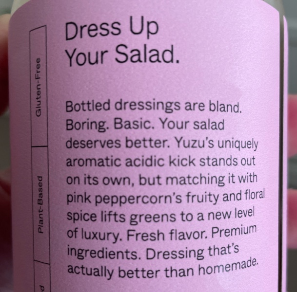
Acid League’s messaging and story are:
- Evocative – they highlight both a problem with standard dressing offerings and present an intriguing alternative with their product
- Informative – the description builds out the details of the ingredients and how they contribute to the taste of the dressing
- Elevated – the punchy mix of humor, irreverence, and depth of descriptions demonstrate a pattern of sophistication
The Yogurt Dressing’s messaging and story are, well, pretty much non-existent. The only line they offer that goes beyond a straight functional description is “FEEL GOOD about what’s in this bottle.”
Acid League aims to take you on a journey and tap into your emotions. The Yogurt Dressing brand simply tells you what to feel without much substance to support it.
Questions to consider for your own brand’s messaging and story:
- What kind of story does your brand tell – what emotions does it evoke?
- Do you dig below the surface or utilize creative language to keep people engaged?
- Are there patterns around humor or conversational language that could help show sophistication in less direct ways?
How Does Your Brand Tap Into Premium Quality Patterns?
Your customers probably won’t do an in-depth analysis of all your brand’s elements to judge its quality. Most of their assessment will happen simply by tapping into their brain’s vast database of patterns.
For your brand, this means your visual and written communication need to be ready for an onslaught of judgments about its quality.
Of course, the patterns we explored here only scratch the surface. There are lots of ways to convey quality. And different patterns may work better than others depending on your industry and audience.
The key is to be aware of how your brand taps into those patterns. The more carefully you consider your brand’s expression, the better chance you’ll have of sending the right message of quality to your customers.

Get Help Telling A Premium Brand Story
If you’re ready to build stronger connections with your customers, reach out for a free consultation. We’ll help you transform your best business thinking into an actionable, shareable, growth-oriented guide. Click below to learn more about the Brand Guidebook process.

