I chatted recently with a good friend and fellow brand strategist, and he brought up the color palette for my company, Map & Fire.
In a very friendly tone he suggested I take a fresh look at the colors because they felt a little dated.
This hit on two of my favorite concepts when it comes to brand and marketing strategy:
- Outside perspectives are invaluable for spotting opportunities and issues in your brand
- Your brand and position are always evolving
These are ideas I preach about all the time, but that doesn’t mean I’m perfect at applying them to my own work. (See, Cobbler’s children)
When he said that though my immediate reaction was, “Wow. It’s been a while since I thought much about our brand identity.”
The truth is, those colors were set when Map & Fire was first formed almost 4 years ago. I mean 4 years ago there was no Apple Music, Google wasn’t Alphabet, and Jeff Bezos was only the tenth richest person in the world. That’s an eternity!
The point is Map & Fire has evolved since then. When it started there wasn’t a clear sense of who our ideal customers were. In the first couple years we worked with every size business from idea-stage startups to Fortune 500.
For bigger corporate clients there was the dark blue of the brand. This was meant to show a more traditional, trustworthy identity that felt solid for clients used to working with big agencies.
For startups, there was the orange highlight that speaks to the bold energy needed in that world. The orange also aligned with the “fire” portion of the company name.
The combination was complementary and felt good.
But as my friend pointed out, it was influenced by a palette that was more common 4 years ago. It’s good to avoid being too trendy with your brand identity, but at the same time it needs to feel relevant to your customers today.
If your brand looks like it belongs to another era, even one in the semi-recent past, it can give the impression that your product or service is out of date as well.
So, it was time for a refresh.
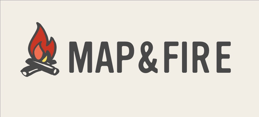
Map & Fire has continued to focus more and more on working with founders of small to medium sized businesses. The tone of the brand is meant to be friendly, accessible, and smart. The brighter, warmer colors of the fire provide the energy, while the gray and tan keep it all grounded.
It’s a palette that hopefully feels more aligned with 2019.
Every Brand Evolves
Even the brands that we think of as being evergreen still evolve over time.
Google’s logo has been consistently refined over its relatively short history. Along with that the colors have evolved as well.
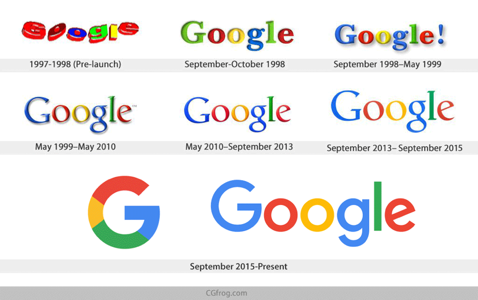
Of course their focus on primary colors is much more classic. Their changes are more about subtle tweaks than wholesale upgrades. But even with these core colors, there’s still a sense of how the tone shifted with the era.
Their non-threatening identity is a prime example of the popular global-corporate-tech look.
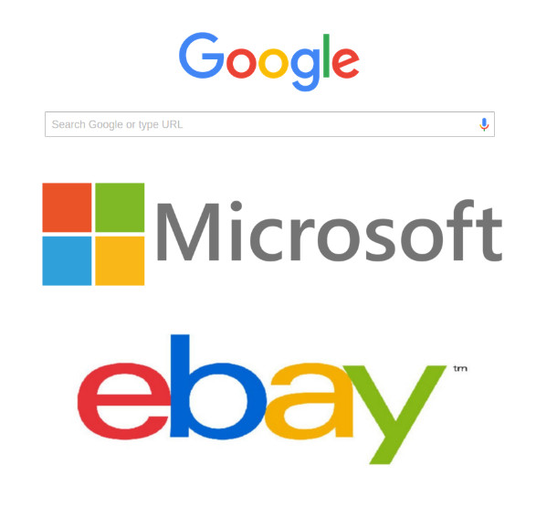
The colors can be interpreted as a blend of trust (blue), growth (green), excitement (red), and warmth (yellow). Together they present a nice, safe blend that’s flexible for multiple product extensions and that avoids potential misinterpretations across different demographics.
The latest to join the safe, 4-color-corporate-tech space is Slack.
![]()
Whether you find the consistency of these brands a bit boring or not, the point is that the colors relate to both a business purpose as well as a point in time.
Meaning and Era
As mentioned above, there are plenty of psychological and cultural associations that have been applied to colors. Every color has a variety of positive and negative associations.
A few common ones:
RED: Love, Power — Anger, Danger
GREEN: Growth, Health — Envy, Greed
BLUE: Strength, Trust — Coldness, Sadness
PINK: Happy, Healthy — Weakness, Immaturity
PURPLE: Creative, Independent — Moodiness, Eccentric
BROWN: Rugged, Modest — Conservative, Dull
BLACK: Class, Elegance — Gloom, Unknown
WHITE: Sincerity, Calm — Isolation, Emptiness
You can read about these in more detail on the Map & Fire website.
While you should take those associations into consideration, you should also take them with a grain of salt.
There’s no perfect color combination that will always speak to everyone in the same way. But you should still be thoughtful about how you select them.
Some questions to consider as you’re refining your brand identity colors or picking them out for the first time:
- Who: Is my target audience likely to interpret these in the right way? Will the colors present our product or service in a receptive light?
- Where: Are the colors appropriate for my competitive space? Do they speak to the industry in any meaningful way? Or are they overused in my space and therefore should be avoided?
- When: Are the shades of colors relevant in this moment in time? Will they make my brand feel too trendy? Dated and out of touch? Or just right?
What all of these questions have in common is that they’re not related to what your favorite colors happen to be. They’re strategic decisions about how your brand can best connect with your customers.
They speak to the meaning of the colors and the time period that they’re being used.
If you’re thoughtful about those decisions and you keep your customers top of mind, your brand identity can be a real asset to build trust and grow your business.
Ready For Your Own Identity Upgrade?
If you’re in need of a brand refresh or just getting started, we have step-by-step resources to help answer important questions about your brand and business. Signup below and you’ll get free access to a set of 7 worksheets to help clarify your brand identity, customers, and much, much more.
Free Brand & Marketing Workbook
Get immediate access to our 10 page workbook to help you define your Core Purpose, Vision, and Core Values, along with resources for Brand Archetypes, Tone of Voice, Messaging, and more!