It’s hard to evolve and improve your brand strategy without good data. Some data connects to your customers – understanding their needs, motivations, and preferences. And other data comes from assessing the competitive landscape – identifying gaps in the market and positioning your brand to take advantage of them.
At Map & Fire we work with brands to improve their direction, positioning, and communication by collecting data specific to their customers and market.
In addition to that, we collect large scale data across thousands of brands to help identify macro-level trends and insights.
The goal is to move beyond general ideas of best practices and focus on specific opportunities that brands can exploit to better connect with customers and grow their business.
In this piece we’re targeting five brand communication insights that impact every business. These are all ideas that your brand can implement quickly to start building stronger customer connections.
1. Imagery Featuring People
Insight:
Use images of people experiencing the benefits of your brand to highlight the value provided and attract more engagement with visitors.
Why It’s Important:
As consumers, we use products and services to improve different aspects of our lives. When we spend our time and money on those things, it’s not about the product or service itself, it’s about the outcome it provides in our life.
One of the most powerful ways to help your audience understand the potential outcomes they could experience is to show people enjoying those benefits.
Research has shown that advertisements featuring faces attract more attention than those without. Your website is often one of the first touchpoints with your brand, so it’s important that it effectively communicates the value customers can expect.
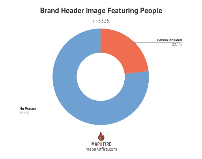
Our Brand Data Says:
Of the 3325 brand websites where we could detect a primary image in the header of the site, only 23.1% featured a detectable image of a person.
This represents an opportunity for your brand to set itself apart and create an emotional brand touchpoint.
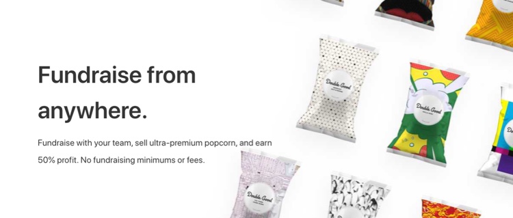
Product Example – Non-People:
A common example of non-people imagery comes from packaged goods companies that instead focus entirely on their product.
Product Example – With People:
Instead, showing a person utilizing the product provides more context and tells a more compelling story of its value.

Service Example – Non-People:
In the B2B services space, companies often rely on abstract graphics or imagery to represent the concept of their offerings.

Service Example – With People:
A more engaging approach is to show people who benefit from the services to make it feel more concrete and emotionally connected.

2. Compelling, Concise Headline
Insight:
Create a headline that’s short enough to pique interest with the reader yet provides enough information to establish context and get them to read more.
Why It’s Important:
It’s common to see messaging issues that fall into one of two categories:
- The brand treats their headline more like a tagline, making it too short to say anything meaningful. These messages tend to be 2-3 words long and are often broad and vague.
- The brand rambles in their message trying to pack too much information up front which encourages readers to skim past it. These tend to be 2-3+ sentences in length.
Finding a healthy middle ground ensures the headline fulfills its job and doesn’t get ignored.
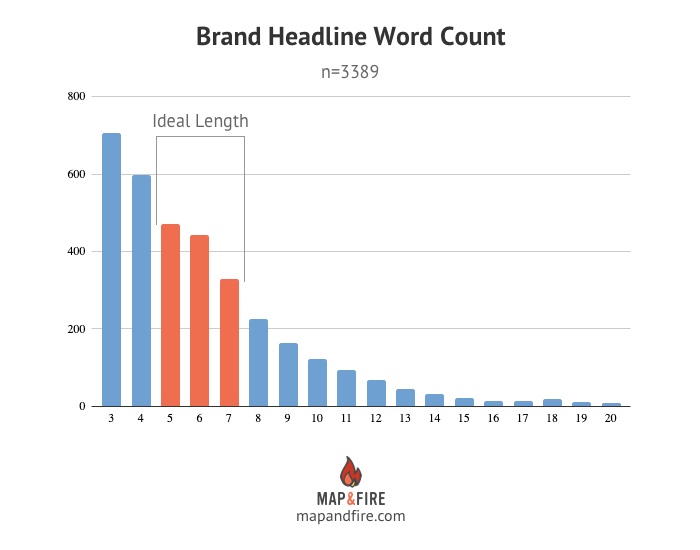
Our Brand Data Says:
Our previous research study on messaging showed that ~6 words was the optimal length for an effective headline. Our new data supports this showing that of the 3389 brands with a headline to analyze, the average headline length was 6.13 words.
However, the most common lengths were 3 & 4 word headlines which represented 38% of the sites overall. Another 25% were 8 words or longer.
In total, this means 63% were sliding into either too short or too long territory.
Headline Example – Too Short:
This headline is too broad and generic to provide any differentiated value to visitors.

Headline Example – Too Long:
This headline has a good sentiment but is wordy and lacks real impact.

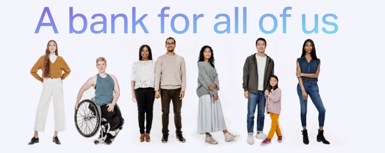
Headline Example – Ideal Length:
This headline provides context on the category along with a core benefit around the brand’s mission of inclusion.
3. Punchy, Supporting Subheadline
Insight:
A messaging subheadline should provide context and detail to support the headline and highlight additional key points of brand value.
Why It’s Important:
While it’s your headline’s job to pique customer interest, the subheadline allows the brand to build on that idea with details of the brand’s offering and value proposition.
Once again though, word count is key. Your goal is to highlight the most critical points of value and differentiation. It’s tempting to try and hit everything here but the longer you go the greater the risk is of someone skipping it entirely.
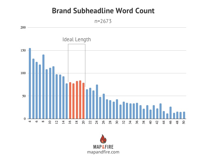
Our Brand Data Says:
Our past messaging research pointed to an ideal subheadline length of around 16 words. In this new research we analyzed 2673 brand subheadlines and ended with an average around 18 words.
However, 37% of the brands we analyzed had subheadlines of 21 words or longer.
There’s lots of room to stand out here by nailing a subheadline length that says just enough for your customers to engage.
Subheadline Example – Too Long:
This subheadline is trying to squeeze too much information into the header. It tries to cover the problem, benefits, features, and even the seeds of a trademarked solution.

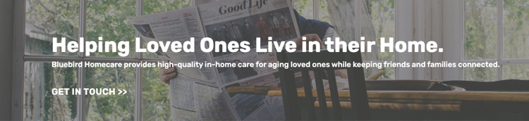
Subheadline Example – Optimal Length:
In this example, the subheadline builds on the message of the headline by adding in additional key details of the service and teasing at higher level value for customers.
4. Positive Sentiment In Messaging
Insight:
Help customers see how your brand improves their lives with a positive sentiment focused on benefits.
Why It’s Important:
When your messaging focuses on descriptions of features and functionality of your offerings it comes across as a neutral sentiment. This means that it lacks a positive (or negative) connotation – it only states facts.
On the other hand, when your messaging demonstrates benefits, the language around it naturally leans positive. It speaks to improvement, growth, and value. These are things that motivate customer buying behaviors.
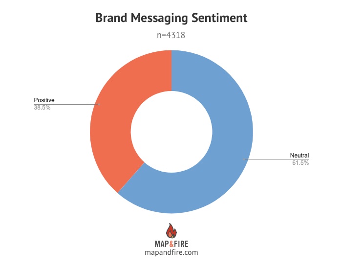
Our Brand Data Says:
Of the 4318 brands whose messaging we could analyze, only 38.5% conveyed a positive sentiment.
There’s a big point of improvement for most brands here to lean into a clear, positive sentiment to better connect with customers.
Sentiment Example – Neutral:
This is a classic example where the headline and subheadline are almost entirely descriptive which results in a neutral sentiment.

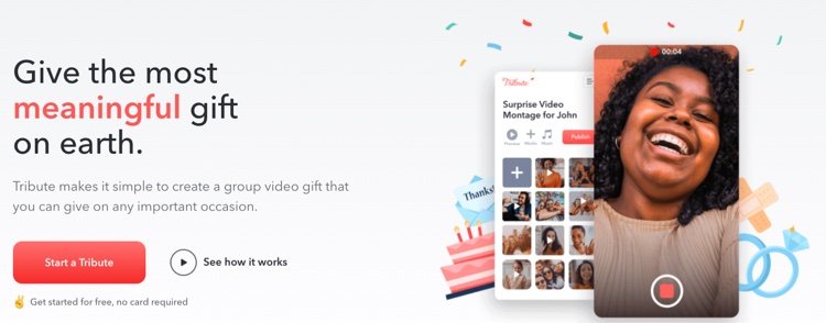
Sentiment Example – Positive:
Here we see a focus on positive customer sentiment that more effectively ties back to the core benefits of the brand’s offering.
5. Use Of Uncommon Colors
Insight:
Use colors that are less common or in contrast with core brand colors to help draw attention to key customer actions.
Why It’s Important:
On a website, it’s generally best to focus users on a single high-value action. This helps create clarity for them and increase the likelihood they’ll follow the most beneficial path for the brand.
To ensure you get the person’s attention, creating CTAs with less common, bright colors helps them stand out and draw focus.
This new color can be specific to CTAs or other key highlight elements. The brand’s core colors can stay exactly as they are.
Our Brand Data Says:
We analyzed the core colors of 4211 companies and found that the top five options – blue, white, gray, black, and green – showed up in 81% of the brands.
The bottom five colors – cyan (turquoise), orange, yellow, purple, pink – only appeared in 8% of brands.
This creates an opportunity to use these colors in a strategic way to get the attention of customers and guide their actions.
CTA Example – Commonly Used Colors:
The use of white and blue for CTAs may align with the brand’s core colors but they’re not well highlighted making them easy to miss.

CTA Example – Uncommon Colors:
Here we have a brand that’s utilizing a bright yellow that’s less common and also provides a high level of contrast with imagery to attract customers to it on the page.

Use Data To Build A Stronger Brand
With the wide range of elements that make up a brand, it’s easy to lose sight of the impact that each individual piece has in connecting with customers. As we’ve shown here, with the help of data and research you can uncover opportunities to improve your brand communication in ways your competitors may have missed.
Of course, the insights we uncovered here aren’t perfect for every audience and every situation. To prove that out, you need to implement the ideas and test them. But no matter what, it provides a jumping off point for areas where most brands can stand to improve.
The important thing is to keep finding ways to access data to improve your strategy and decision making with your brand. The better you understand those elements and align them with your target customers, the more you’ll increase engagement, and the more your brand will grow.

Get Help Connecting With Your Customers
If you’re ready to build stronger connections with your customers, reach out for a free consultation. We’ll help you transform your best business thinking into an actionable, shareable, growth-oriented guide. Click below to learn more about the Brand Guidebook process.