
When developing a brand it’s easy to find yourself trapped in a mental bubble. You live and breathe your business every day, and as a result tend to lose perspective on the work.
This can lead to writer’s block for your messaging, designer’s block for your visuals, and strategist’s block for your positioning.
To break out of those ruts, it’s helpful to see what other brands are doing.
And while there’s an aspirational benefit to studying well known billion dollar brands, their approach and execution generally isn’t relevant or achievable for a company building a brand from scratch.
A better approach is to look at brands that are gaining traction at the stage a few steps ahead of where you are now. The lessons learned from those brands are more immediately applicable to building up your initial audience.
Luckily, there are tons of great examples out there of small and medium sized companies punching way above their weight.
These are brands that are actively crafting and honing their voice. They’re looking to make their mark and cut through the noise. And they’re at a size where they can take chances those 800lb gorillas won’t.
And the insights we can gain from these brands are actually relevant to companies of all shapes and sizes. Startups can see new ways to level up their game, and mega-brands can spot emerging trends from the nimble folks gunning to steal their market share.
Best of all, focusing on relatively small companies means that you’re seeing a level of work that’s within reach for your business, too. That’s not to say this type of execution is easy, but with talented people, a strategic approach, and lots of elbow grease it’s achievable.
With that, here are 31 small(ish) brand websites (in alphabetical order) executing at a high level to help inspire your own marketing efforts.
NOTE: We created an editable spreadsheet with all the brands listed below, so if you have more stand out brands to contribute please add them in:
Click here to access the spreadsheet
Aloha
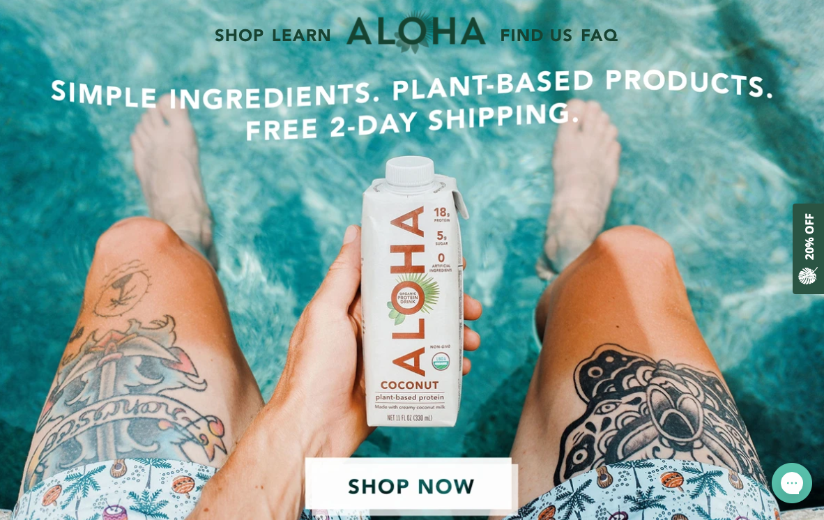
Company: Aloha
Website: https://aloha.com/
Offering: Plant-based food and drink products
Inspiration: Striking imagery that creates natural focus on the product and speaks to the target demographic.
Opportunity: Lead message is strictly functional and could benefit from an injection of personality to establish a more welcoming tone.
Aprch
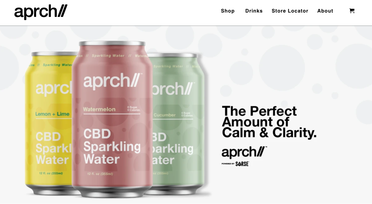
Company: Aprch
Website: https://drinkaprch.com/
Offering: CBD drink
Inspiration: Clear, benefit-focused message for those exploring the CBD space.
Opportunity: Above-the-fold image (cropped slightly here) would be stronger if accompanied by some sort of messaging without needing to scroll down.
Aspiration
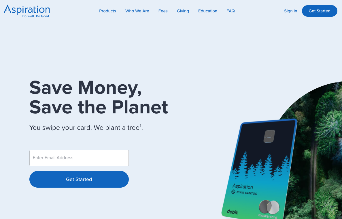
Company: Aspiration
Website: https://www.aspiration.com/
Offering: Financial services
Inspiration: Immediate thread that weaves together functional money-saving benefit and aspirational self-transcendence benefit of helping the environment.
Opportunity: Messaging is very sparse and could be stronger with more clarification of what the service provides in the subheader.
Baboon To The Moon
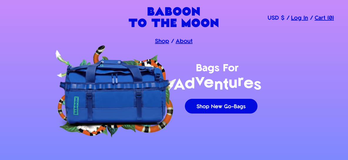
Company: Baboon To The Moon
Website: https://baboontothemoon.com/
Offering: Luggage
Inspiration: Tone is fun, playful, and the lead image creates an immediate emotional connection with the product.
Opportunity: Header could tease at some light supporting messages on what makes these bags unique beyond the bright colors.
Care/of
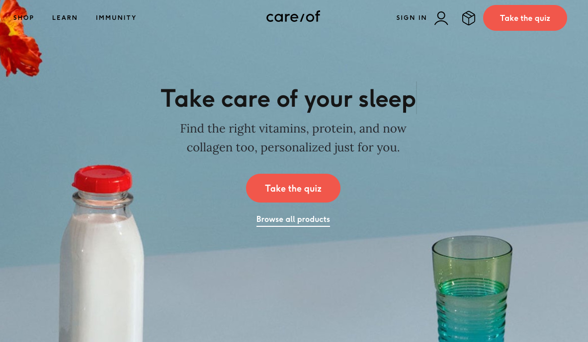
Company: Care/of
Website: https://takecareof.com/
Offering: Daily vitamins
Inspiration: Message of health and simplicity reflected in the message and imagery.
Opportunity: Lead image, while beautiful, would feel warmer and more grounded with a stronger human element.
Comrad
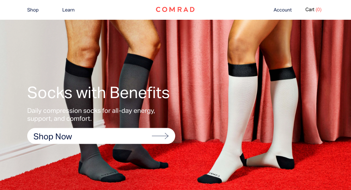
Company: Comrad
Website: https://www.comradsocks.com/
Offering: Compression socks
Inspiration: Clarity around what the core product is while adding some light elements of fun and tasteful sex appeal to an otherwise tame product.
Opportunity: Tagline is vague and could be more impactful by teasing at a specific benefit rather than alluding to a general idea of benefits.
Cotopaxi
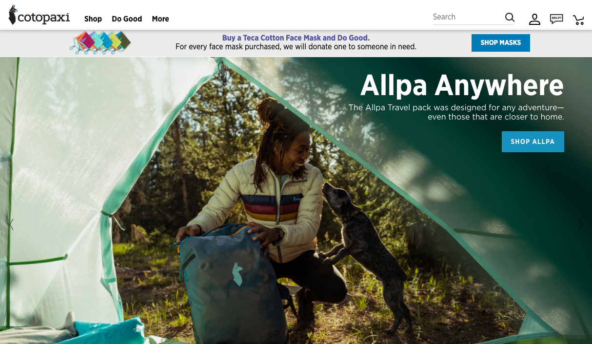
Company: Cotopaxi
Website: https://www.cotopaxi.com/
Offering: Adventure gear
Inspiration: Candid photography provides a sense of authenticity and real-world product use.
Opportunity: The joyful energy in the brand’s imagery could be more deeply integrated into the copy which is friendly but largely functional.
Cumbe
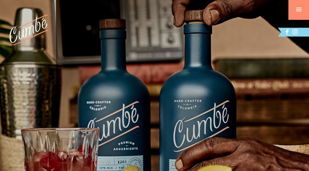
Company: Cumbe
Website: https://cumbespirits.com/
Offering: Alcohol (aguardiente)
Inspiration: Gorgeous, warm image quickly conveys the sophistication and quality of the brand.
Opportunity: With a new (to most people) type of alcohol, could use the messaging to provide some hints of product education on flavor profile and typical use.
Dropps
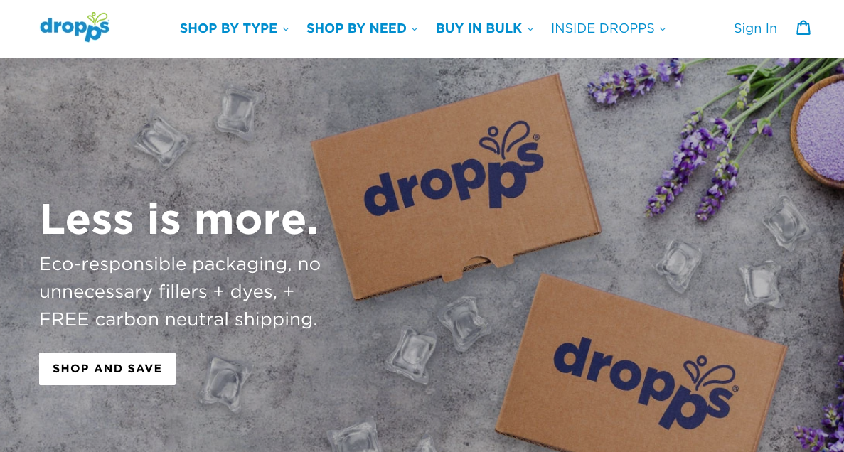
Company: Dropps
Website: https://www.dropps.com/
Offering: Detergent
Inspiration: Imagery and messaging both support the key benefits and functional aspect of the subscription model.
Opportunity: The header would improve its clarity (and SEO quality) with at least some mention of the detergent product category.
Everlywell
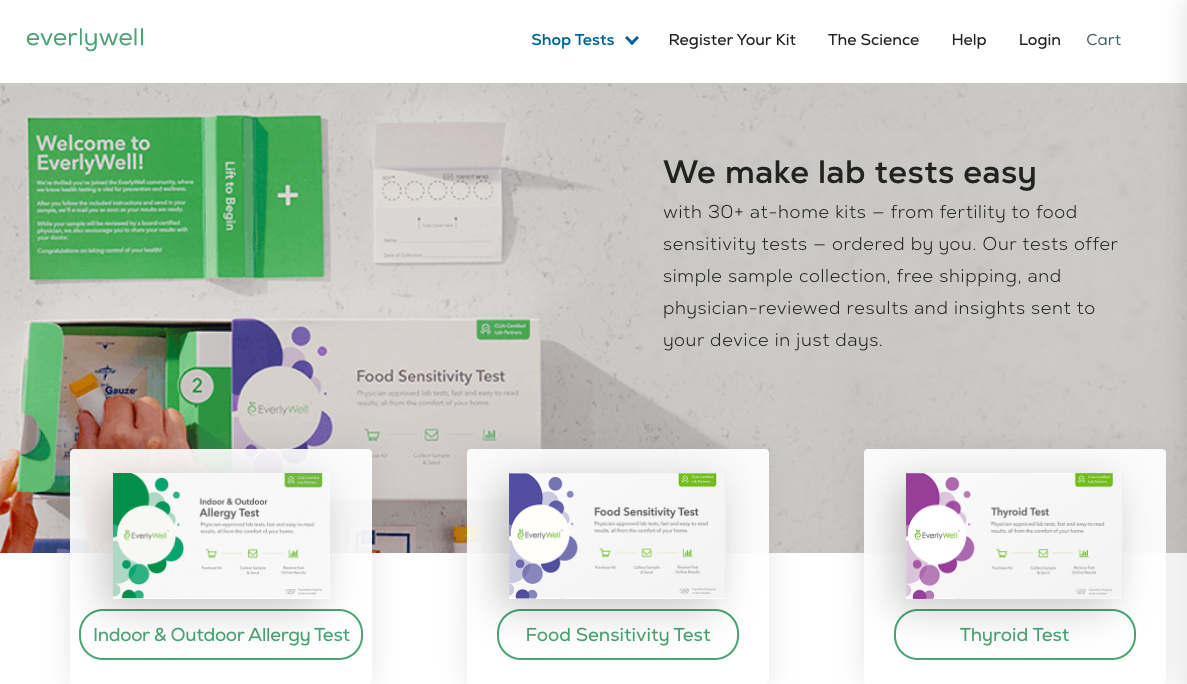
Company: Everlywell
Website: https://www.everlywell.com/
Offering: Home health tests
Inspiration: Tight, descriptive messaging explains the core benefit and function right away.
Opportunity: Rather than the repetition of box images, could create more emotional connection with small images of customers for each use-case.
Fernish
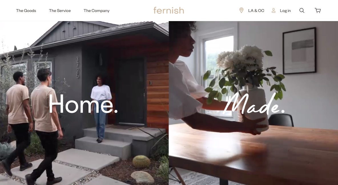
Company: Fernish
Website: https://fernish.com/
Offering: Premium furniture rental
Inspiration: Clever split-screen video combines functional service shots with emotional benefit shots.
Opportunity: The header is emotionally impactful but the brand’s story and value would be more clear if the messaging expanded beyond the tagline.
Floyd
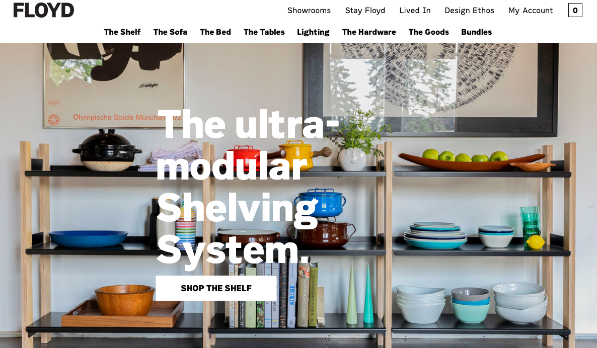
Company: Floyd
Website: https://floydhome.com/
Offering: Modern, modular furniture
Inspiration: Imagery strikes a great balance between feeling aspirational yet still attainable.
Opportunity: The lead message could provide more clarity and personality in describing why being “ultra-modular” is a benefit customers need.
Frank Body
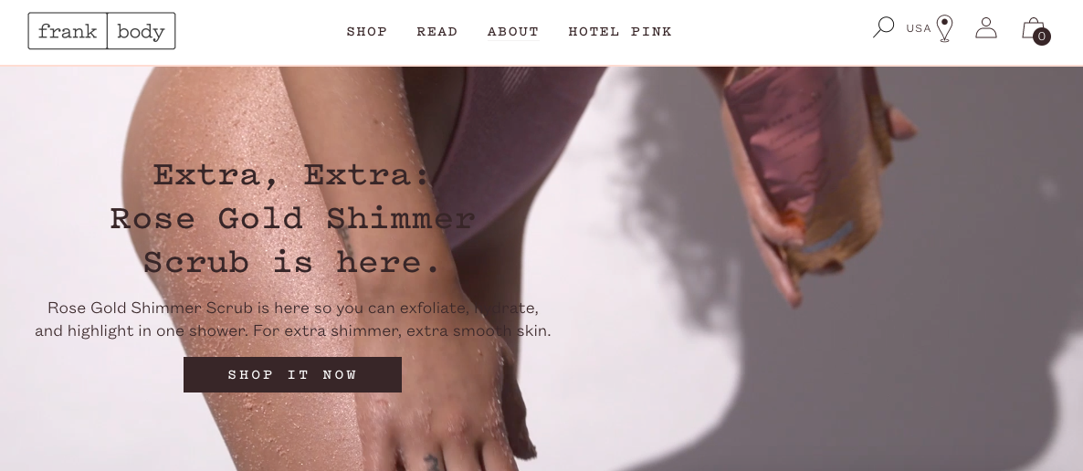
Company: Frank Body
Website: https://www.frankbody.com/us/
Offering: Skincare
Inspiration: Video and messaging provide a quick appealing combo of explaining the product and showing its use.
Opportunity: Rather than a functional listing of the product’s name, the headline could speak to emotional benefits and establish the brand tone.
Haus
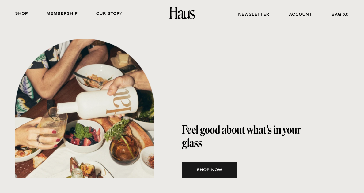
Company: Haus
Website: https://drink.haus/
Offering: Alcohol (apéritifs)
Inspiration: Organic imagery and “doorway” design create a warm, welcoming connection between the brand and product.
Opportunity: With so much whitespace, there may be room for a tease of functional information on what the product is and why it’s unique in the header.
Hims
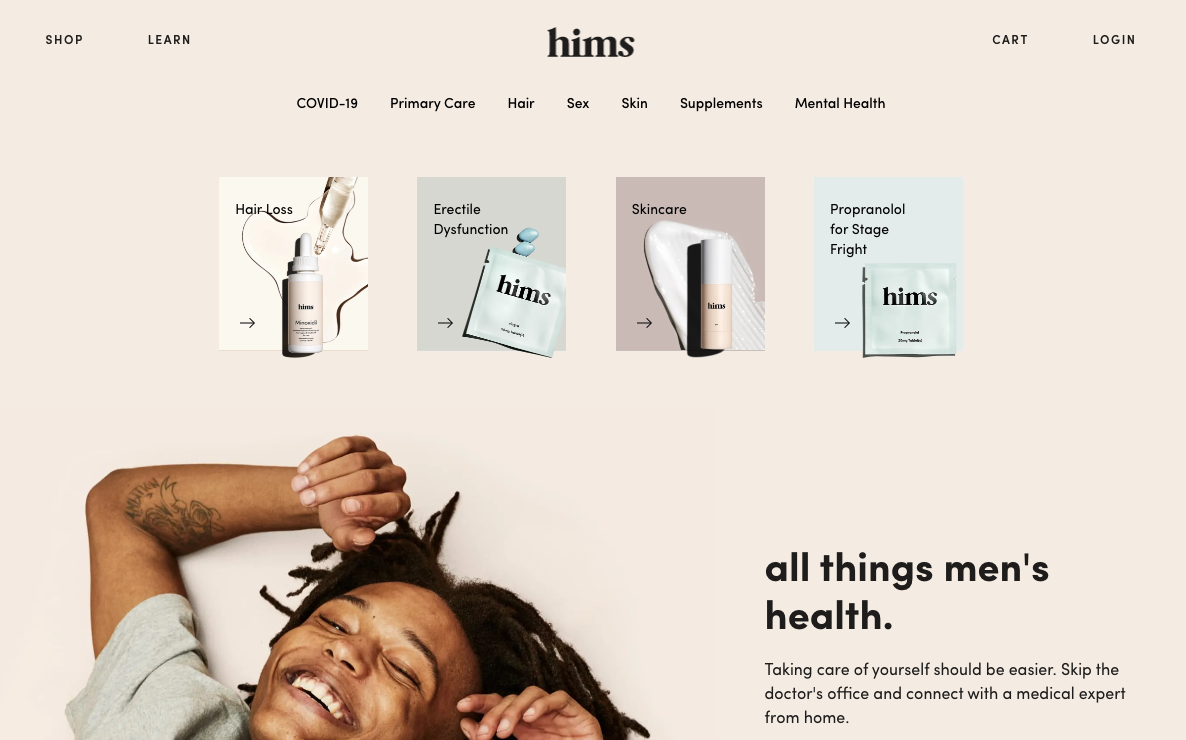
Company: Hims
Website: https://www.forhims.com/
Offering: Men’s telehealth and health products
Inspiration: Awesome blend of product, message, and people to show what the brand delivers.
Opportunity: With the potential emotional blockers that exist in this space (e.g. embarrassment, pride, etc), the brand could lean into normalization of issues.
Jiant
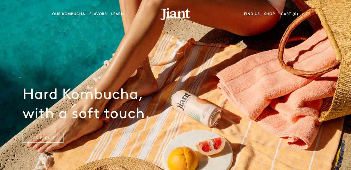
Company: Jiant
Website: https://www.jiantkombucha.com/
Offering: Hard Kombucha
Inspiration: Imagery is warm and vibrant, and sets the tone for the brand overall.
Opportunity: For those new to kombucha, there’s an opportunity to provide some insights into the actual flavor or what makes the product unique beyond the alcohol content.
Judy
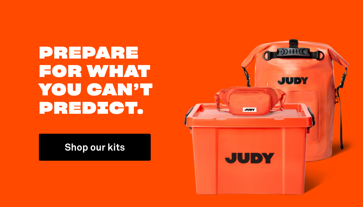
Company: Judy
Website: https://judy.co/
Offering: Emergency kits
Inspiration: Straight forward message, colors, and typography that align with a sentiment of security and confidence.
Opportunity: Swapping the abstract character illustrations (further down the page) for real people could help make the safety message feel more emotionally grounded.
Kin Euphorics
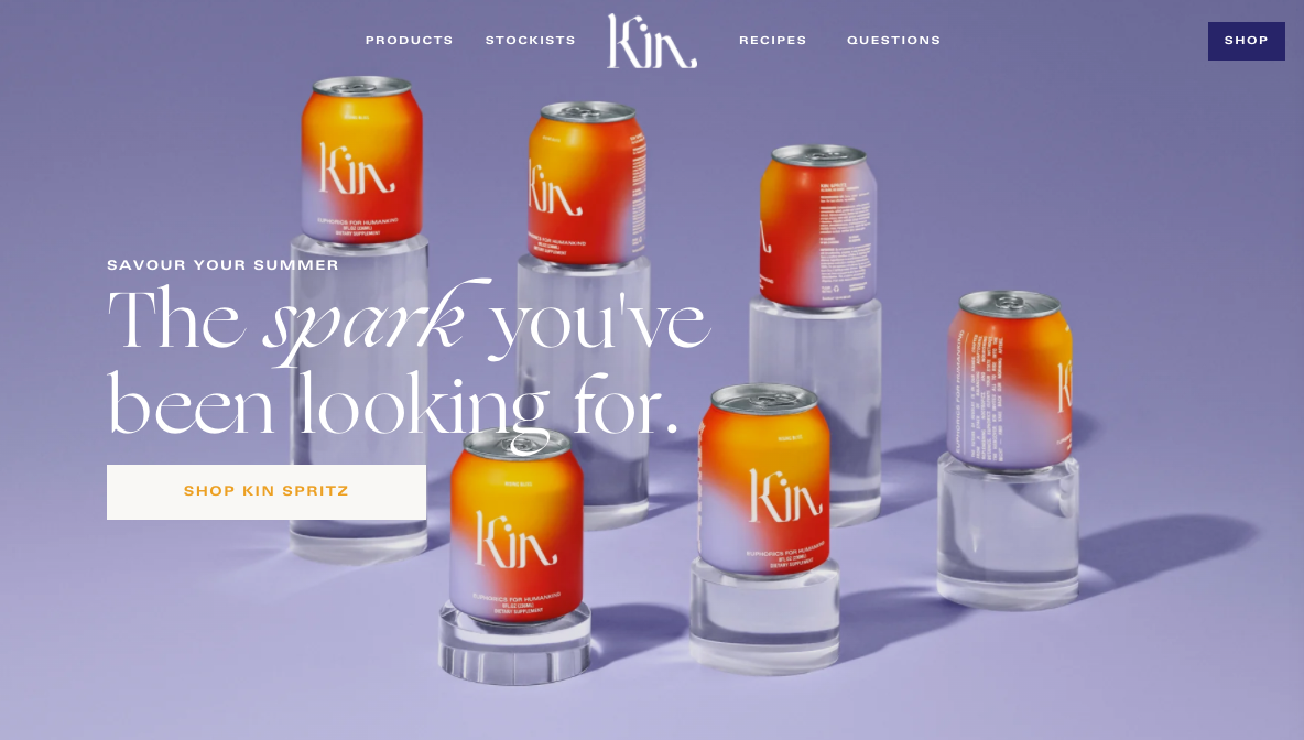
Company: Kin Euphorics
Website: https://www.kineuphorics.com/
Offering: Non-alcoholic, mood-enhancing beverage
Inspiration: Stylish, premium feel that’s bright and feels connected to the feeling they claim the drink provides.
Opportunity: Considering they’re creating a new category of beverage with “euphorics”, they could build trust by making the ingredients more front and center.
Lemon Perfect
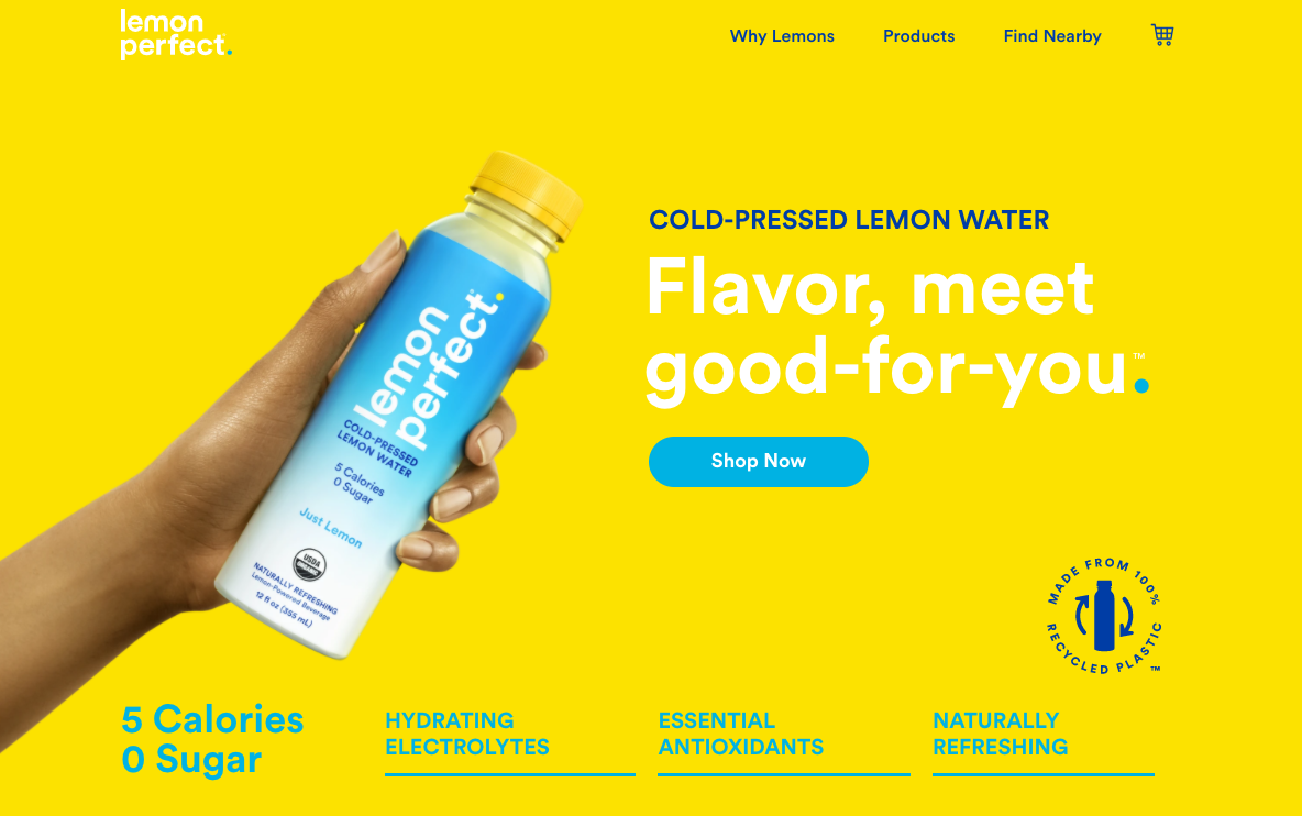
Company: Lemon Perfect
Website: https://lemonperfect.com/
Offering: Lemon water
Inspiration: Bright, clean aesthetic feels refreshing and naturally aligns with the product.
Opportunity: With a highly competitive flavored water market, they could highlight why lemon water is superior to adjacent products like coconut water.
Magic Spoon
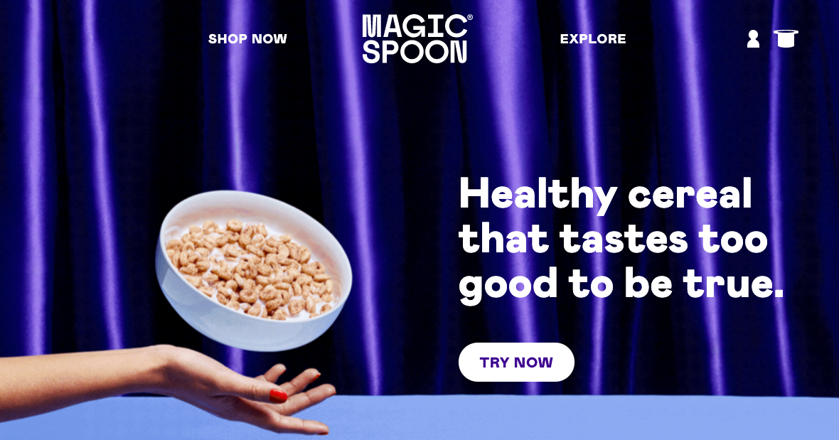
Company: Magic Spoon
Website: https://magicspoon.com/
Offering: Keto-friendly, healthy cereal for adults
Inspiration: Design and messaging support the overall balance of a fun tone paired with real health benefits.
Opportunity: The message of giving adults the feeling of a kid eating cereal (without the guilt) would land harder with some images of healthy adults looking giddy engaging with the product.
Maude
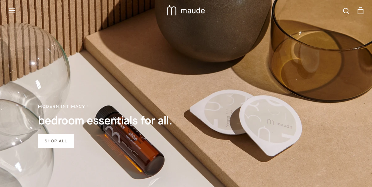
Company: Maude
Website: https://getmaude.com/
Offering: Sexual wellness products
Inspiration: The minimalist imagery and simple messaging feed into the promise of treating this category with class and delivering high quality.
Opportunity: The style and tone are so discreet that it could use some additional human elements to avoid losing all sense of sexuality.
Montucky Cold Snacks
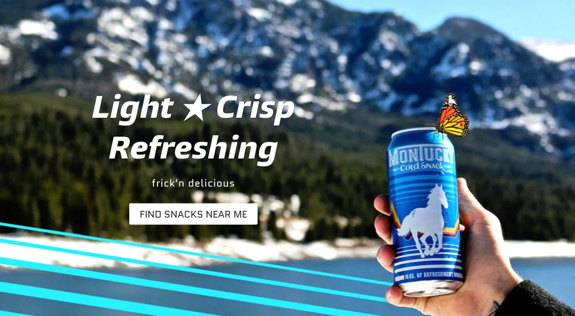
Company: Montucky Cold Snacks
Website: https://montuckycoldsnacks.com/
Offering: Beer
Inspiration: Retro, goofy light beer vibes dialed up to 11.
Opportunity: There could be some fun opportunities to compare it to all the other generic, macro-brew options or emphasize it as an alternative to all the ultra-hoppy IPAs.
N26
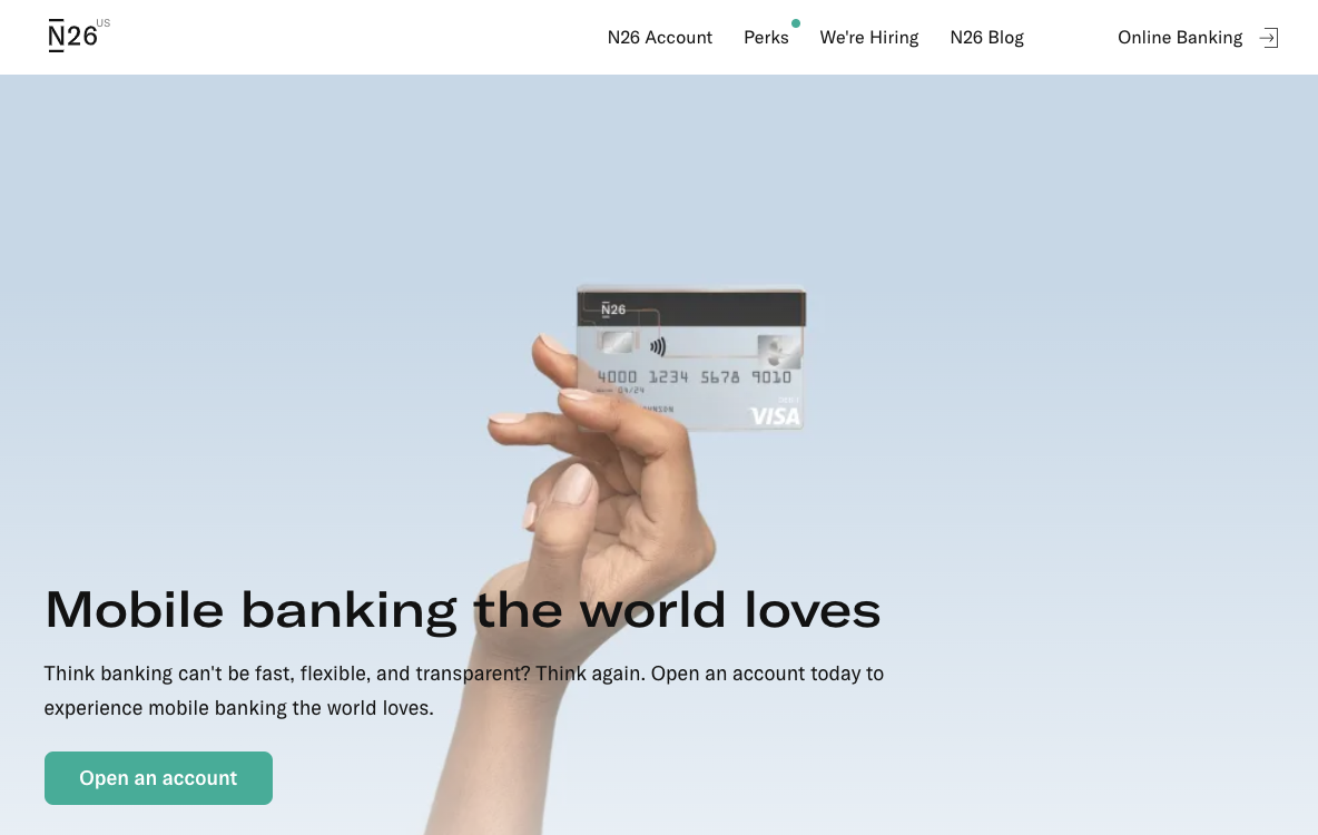
Company: N26
Website: https://n26.com/en-us
Offering: Mobile banking
Inspiration: The message of speed and transparency is well supported by the sleek design.
Opportunity: The service might feel more accessible with representation of the target market and less emphasis on abstract graphics and product screenshots.
Oatly
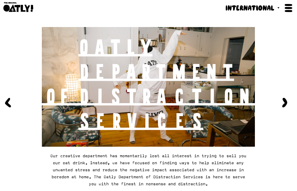
Company: Oatly
Website: https://www.oatly.com/int/
Offering: Non-dairy, oat milk products
Inspiration: Their casual, witty, silly — yet always honest — tone permeates every aspect of their brand which makes it feel connected and consistent at every turn.
Opportunity: For someone new to oat milk (like me!) there could be some advantages to making the health benefits of the product more upfront and accessible.
Otherland
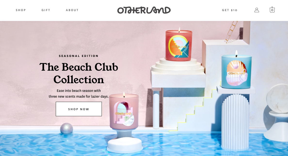
Company: Otherland
Website: https://www.otherland.com/
Offering: Scented candles
Inspiration: All the visual elements are hand-crafted, warm, and premium in their look and feel.
Opportunity: With how specific and descriptive the overall messaging is, the header would be more engaging with some evocative copy in place of a functional collection name.
Our Place
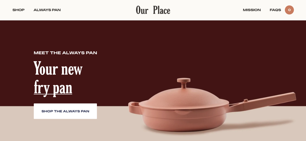
Company: Our Place
Website: https://fromourplace.com/
Offering: Kitchen essentials and cookware
Inspiration: Elegant, modern design that makes kitchenware feel almost like art.
Opportunity: The rotating headline highlights the functional flexibility but could be stronger by making an emotional connection around the unique design and premium quality.
Recess
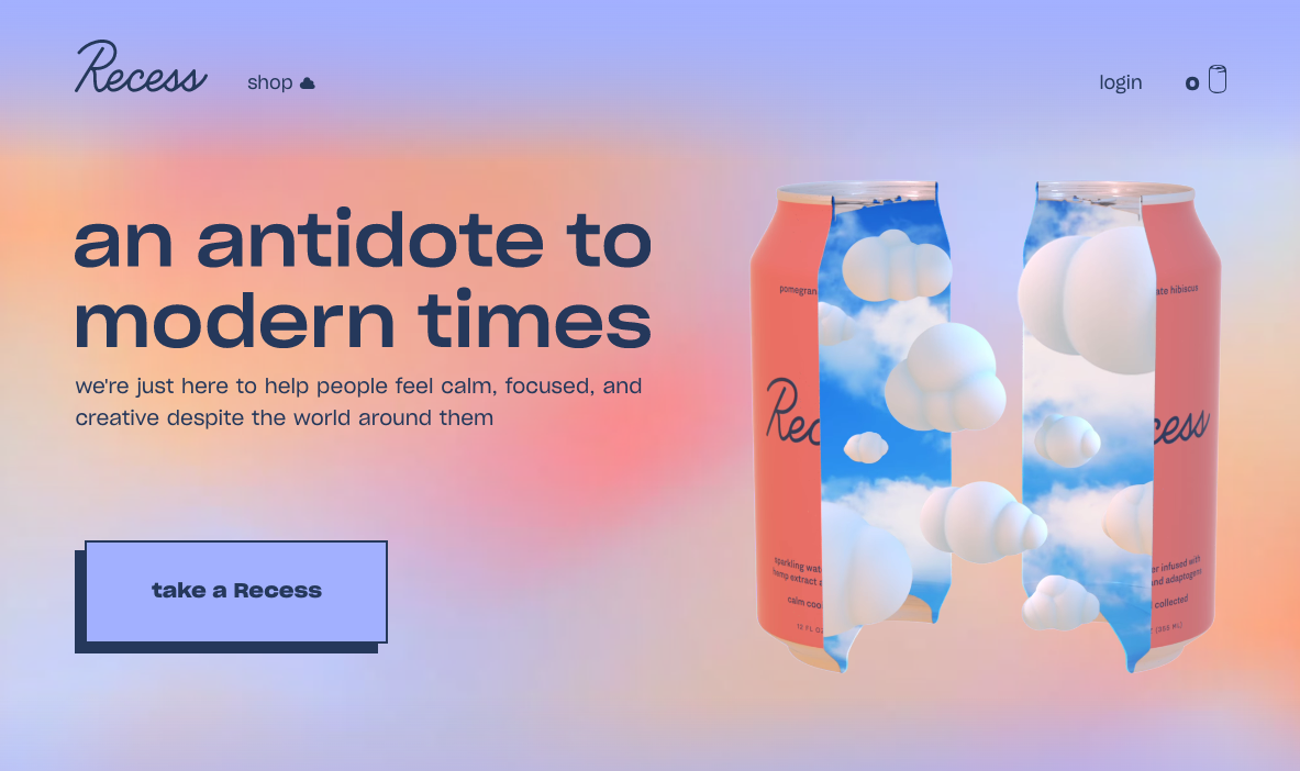
Company: Recess
Website: https://takearecess.com/
Offering: CBD beverage
Inspiration: Chilled out, surreal visuals and casual tone all feed into support of the brand’s promise of increasing calm.
Opportunity: While awareness around CBD grows, there may be benefits to teasing more at the science of the ingredients to avoid product confusion and build trust with new users.
Reunacy
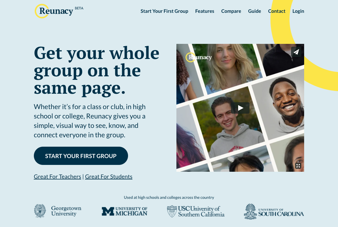
NOTE: This is a brand Map & Fire is developing
Company: Reunacy
Website: https://reunacy.com/
Offering: Virtual class rosters for remote learning
Inspiration: Highlighting the emotional aspect of remote learning by focusing on the kids it impacts and the challenge of making them feel connected.
Opportunity: Creating a message that speaks to the practical needs of educators while creating excitement and engagement for students.
Tracksmith
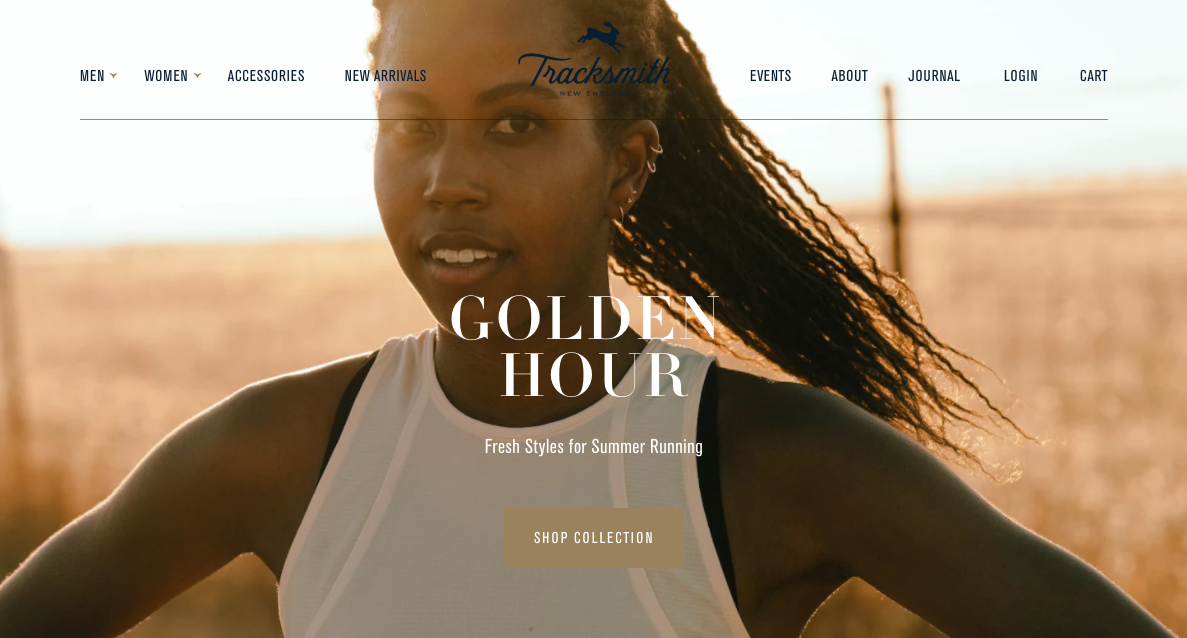
Company: Tracksmith
Website: https://www.tracksmith.com/
Offering: Running gear
Inspiration: Strong focus on photography that’s aspirational but feels more organic than the typical mega-sports-brands.
Opportunity: The header copy could expand to include some specific details of the products to show that the brand really understands its target audience.
Visible
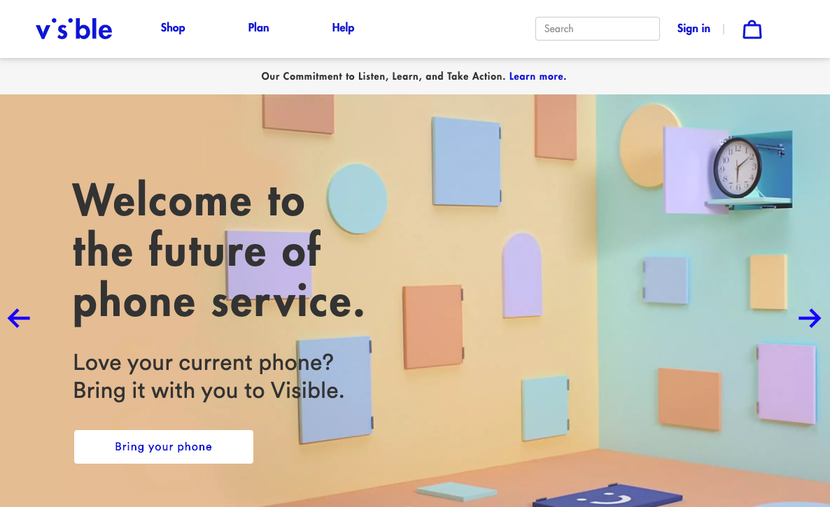
Company: Visible
Website: https://www.visible.com/
Offering: Mobile phone service
Inspiration: The message of access, affordability, and flexibility build an enticing case to convert over customers of legacy providers.
Opportunity: Bubbling up some of the key differentiators of the brand would help support the promise of this being “the future of phone service”.
Who Gives A Crap
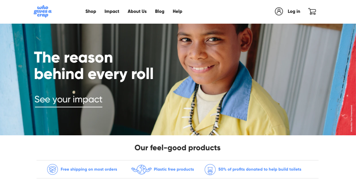
Company: Who Gives A Crap
Website: https://au.whogivesacrap.org/
Offering: Subscription-based, globally responsible toilet paper
Inspiration: High emphasis on the global good they do environmentally and socially while also delivering a high quality product.
Opportunity: The focus of their brand is way beyond simple price comparisons, but some simple callouts could help show prospective customers that the price point is very comparable.
The Right Inspiration Can Go A Long Way
The great part about seeing a large collection of examples like this is that it provides lots of different angles for looking at the same core challenge — communicating your brand’s value clearly to build compelling connections with your audience.
Whether your brand is just getting off the ground or you’re further along in the process, that work of building customer relationships never ends.
There’s no single example that can provide a template for how your brand should operate, but collectively these brands reinforce best practices that will strengthen your position and communication.
By studying their hard work, you can improve your brand’s ability to cut through the noise and reach more of the people you’re aiming to serve.

Get Help With Your Brand’s Position, Message, And Visuals
If you’re ready to build stronger connections with your customers, reach out for a free consultation. We’ll help you transform your best business thinking into an actionable, shareable, growth-oriented guide. Click below to learn more about the Brand Guidebook process.

