As someone whose writing is focused mainly around my work — in particular, topics like entrepreneurship, strategy, and psychology — I’m a little obsessed with learning which types of articles generate interest and why. It’s a mostly healthy obsession as it’s centered around trying to make the strongest possible connection with readers.
The easy part of feeding that learning obsession is the endless supply of topics I’m genuinely excited to write about. The trickier part is the constant battle to communicate about those topics in ways that other people will find interesting.
And that’s really the core of everything we do in business — finding a legitimate need of an audience and then creating a unique way to satisfy that need. Of course nailing the “fit” for your solution is easier said than done.
This challenge of “fit” is particularly tricky in writing because for any given piece you typically only get one shot at making it work. That one shot entails hitting on a legitimately useful topic and making sure it’s wrapped up with enough emotional intrigue to get someone to click on it and spend their valuable time consuming it.
Sometimes that “fit” hits the mark, sometimes it’s a bust.
A recent bust I had gave me an idea for an experiment — conduct an A/B test of sorts by publishing the exact same article twice with different titles and illustrations, to see what could be learned by pitting them head-to-head.
Here’s what happened.
The Birth of the Experiment
As I’ve become more focused on writing, I’ve watched my stats on Medium like a hawk. The first four articles I published, while small in numbers, at least showed an overall upward trend in views:
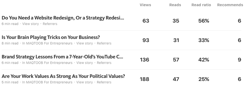
Even with this small sample size, there were a couple interesting takeaways:
- My most personal article, (“Brand Strategy Lessons From a 7-Year-Old’s YouTube Channel”), which focused on an experience with my son, achieved the best overall engagement. No doubt this supports the popular, and wise lesson to “share not teach”.
- The article I wrote about work values (“Are Your Work Values As Strong As Your Political Values”) featured an illustration of Trump and Hillary and was my most viewed, but performed poorly in terms of read ratio. I suspect the image may have implied a true political article and disappointed some when it in fact focused on the topic of values.
Good insights, and easy to digest in this flow of upward movement.
Then came my next article. The premise was that everyone can benefit from having an outside perspective on their business, because when you operate from the “inside” it’s easy to miss important elements of what you’re doing.
This is the image and title I came up with:
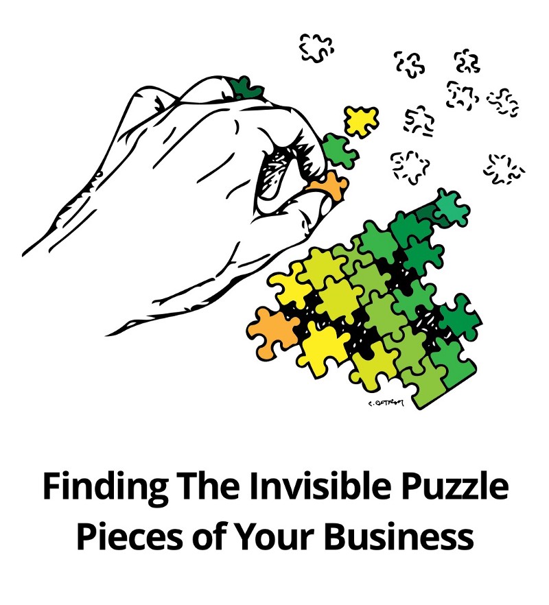
These were the results:

Ooph.
Thoughts on this:
- My readership is small but that’s still an 82% drop in views from my previous article.
- The read ratio and recommends weren’t too different from past works, but the lack of views stood out. Was the topic really that unappealing? Was the title too vague? The image boring?
- One contributing difference was that the previous three articles had been published on Maqtoob, a Medium publication dedicated to entrepreneurship, but this one hadn’t been.
With samples this small it would be easy to attribute most of my extra readership to that publication. However, looking at referrals on past articles, it’s never clear exactly how much traffic can be attributed to a particular source.
So, I wondered: Could I significantly improve my views simply by creating a better title and illustration?
I decided to find out.
The Republishing Experiment
Two days after publishing the initial article, I drew a new illustration and came up with a new title for the article.
My goals were:
- Create an image that was more provocative and eye catching.
- Create a title that was more straightforward about the concept of the article.
This is what I went with:

I published the article again. Here were the results:

Better-ish at least in terms of views. Read ratio was terrible. Recommends were pretty good (relative to my past articles).
Takeaways from this round:
- As you can see in the stats, this version did get picked up by Maqtoob (thanks, Kristyna Z.!), so that certainly contributed to an exposure bump.
- But I did seem to have achieved something that was more attention-grabbing.
- However, that attention appeared to result in clickbait behavior (people who view but don’t read), even though this is by no means intended to be a clickbait article.
- The ratio of recommends to reads is really good, so at least those that made it through found it valuable.
- I had pushed the original version (“Puzzle Pieces”) on Facebook and email. This time it was strictly an experiment on Medium, so that reduced the number of clicks from people that already trust me.
So, was it a success? Had I created a version that was more engaging, at least from an initial click-through standpoint?
I wasn’t totally convinced.
Time to Settle This With Science
To try and add at least a little bit of validity to this experiment, I decided to use an actual poll.
The idea to use a poll came via a great article I read by Mike Fishbein on self-publishing a bestselling book. Part of his process involved an online service called PickFu that he used to help select his book title and cover. PickFu allows you to quickly and cheaply conduct polls around things like book covers, marketing ideas, interface mockups, etc.
In addition to getting quantitative numbers on votes and demo breakdowns, PickFu provides a qualitative response from each person that votes. This seemed perfect to test my article “covers”.
My questions going into the poll:
- Was the difference between the views I got on each article an accurate indicator of the difference in audience interest?
- Was my hypothesis correct that a more provocative illustration combined with a more straight forward title would be the preferred version overall?
$20, and 50 responses later, I had my results:
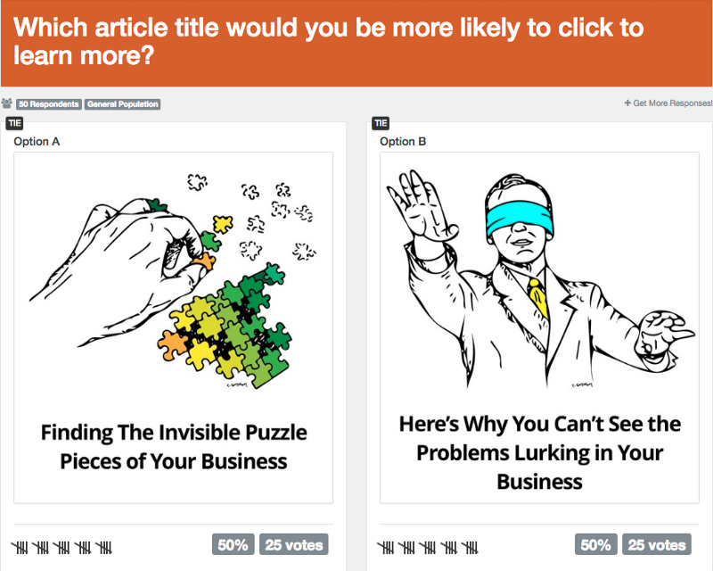
A Perfect Split.
50–50.
25 Votes Each.
Ha.
To learn more I looked at the demographic info and individual responses.
Digging Deeper Into the Poll Results
Here are the demographic breakdowns for each option — Option A is “Puzzle Pieces” and Option B is “Blindfold”.
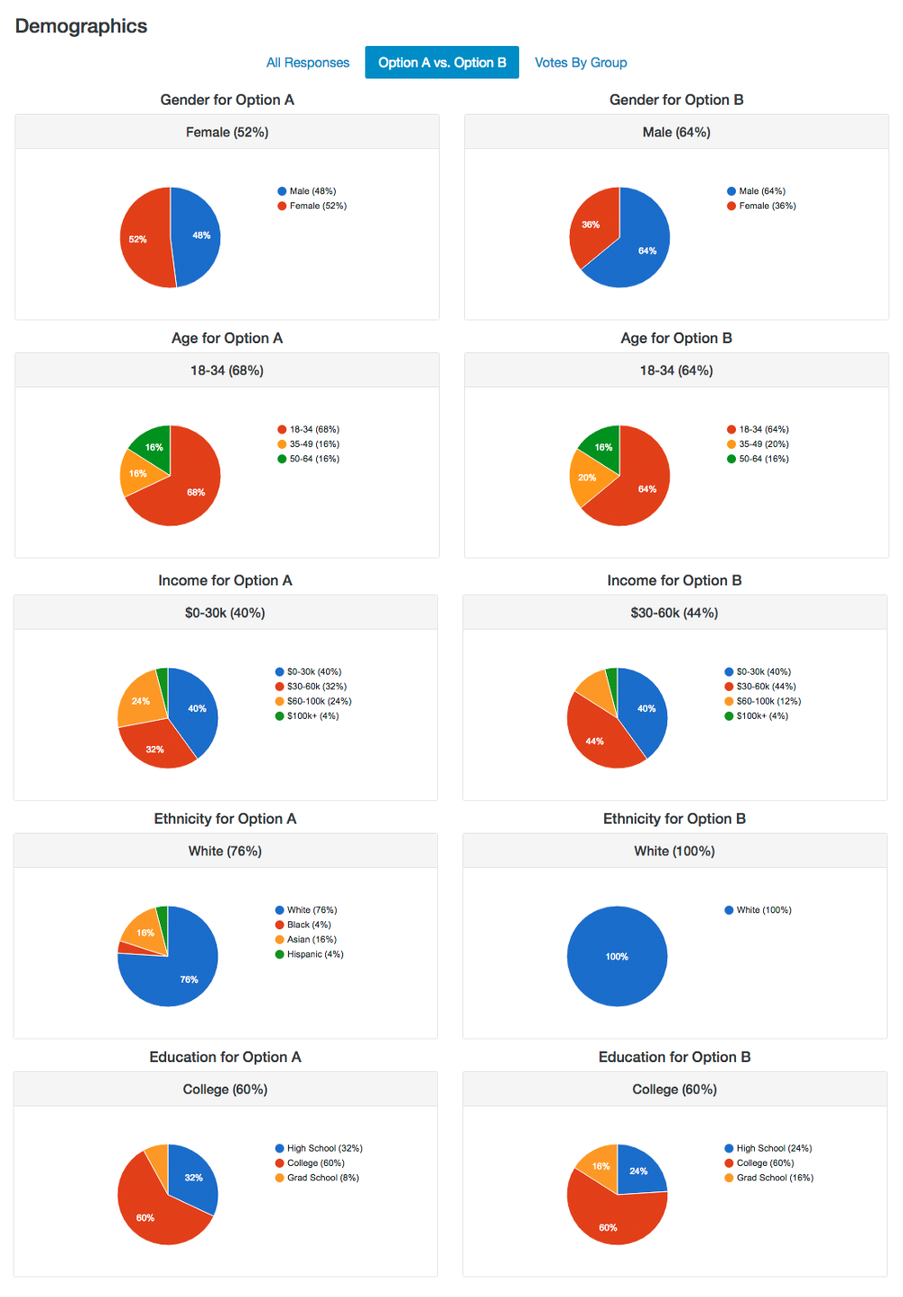
A few rough takeaways from that:
- The “Puzzle Pieces” image that focused only on a picture of a hand skewed more female and more diverse. The “Blindfold” image that basically looks like a white man, not surprisingly skewed male and white. This certainly gives support to the importance of the imagery you use to accompany an article. Whether it’s conscious or subconscious how a person identifies with an image will likely impact his or her desire to engage with it.
- In terms of the education demo, both options had the same representation from college-level respondents. “Blindfold” skewed a little higher on grad school, while “Puzzle Pieces” skewed a little higher on high school. Again, there may have been some self-identification at play where more grad school individuals are in environments with people in suits. Maybe.
- “Puzzle Pieces” skewed a little higher on the top half of income brackets. It’s possible that there’s a slight correlation between those with more income having more freedom to spend time thinking about puzzles or other abstract challenges. It’s a reach but something to consider.
Finally, what about the voter comments? Did either option favor emotional or analytical reasons for selection?
Digging Deeper Into the Comments
I decided to organize all the responses into those two categories: analytical and emotional.
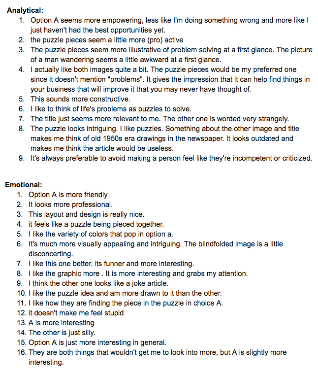
This process was very subjective but based on my interpretation, once again it was an even split. For each article option, I found 9 comments (⅓) to be somewhat analytical in nature and 16 comments (⅔) to be more emotionally based.
Option A, “Puzzle Pieces” Comments (unedited):
Option B, “Blindfold” Comments (unedited):
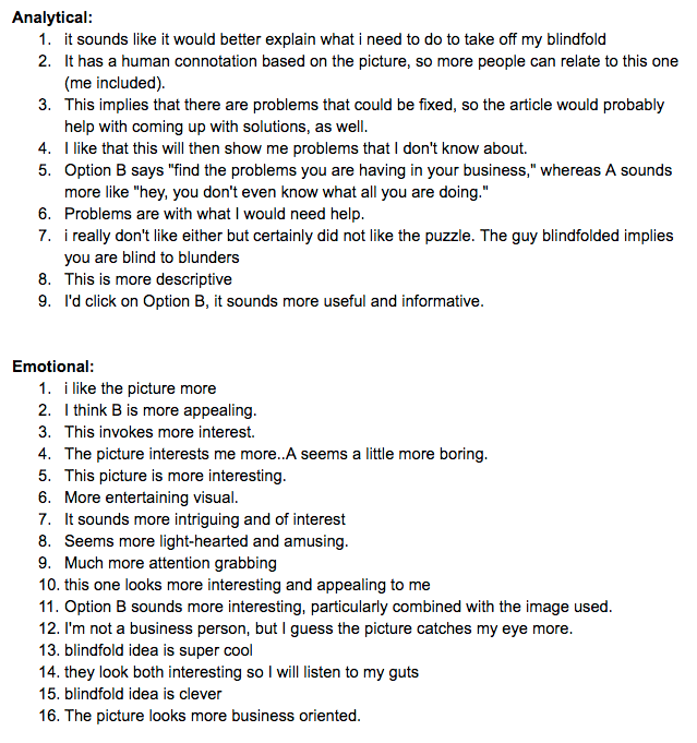
As I said, the above categorizations are subjective, but it at least shows that both versions appealed to some people who judged the content analytically, and some who judged it emotionally.
The good news is that the specific reasonings for each was more or less in alignment with what I had intended:
- “Puzzle Pieces” brought out words like “intriguing”, “empowering”, “illustrative” — i.e. teasing interest on a more abstract level.
- “Blindfold” brought out words like “descriptive”, “solutions”, “explain” — i.e. creating a more straightforward connection around the content.
But in terms of one being objectively “better”? Can’t say there’s a winner.
Both of these options were crafted to target the audience we’re looking to connect with (entrepreneurs, business-minded folks), and both options made connections but in slightly different ways.
Conclusions
So, what can we learn from this experiment?
- The same piece of content can appeal to (or repel) some people for analytical reasons and others for emotional reasons — but emotional reasons will likely be greater.
- People will have LOTS of reasons for making their decisions and you’ll only be able to predict a fraction of them (e.g. I wouldn’t have guessed that “Blindfold” would be interpreted as a “joke” or “silly”).
- Getting fast feedback around a decision you’re making using a survey tool like PickFu is extremely valuable.
With that being said, the two biggest lessons to remember:
- Getting someone to click on your article (or website, or email, or social post, etc.) is a critical step, but you still need great content inside to convert them into readers (or buyers, followers, etc).
- Predictions and assumptions can only take you so far. To validate (or invalidate) those assumptions you need real feedback from unbiased people.
The good news is, you can always keep experimenting. I know I’ll be eager to see what I can learn from the folks that read this article. So, make your contribution to science and let me know what you think!
Want Help Connecting With Your Audience?
At Map & Fire we use our Brand Guidebook process to help entrepreneurs and business leaders make sense of their business, including creating fit between their customers and their offering.
If you need help, download our free brand strategy workbook below. It’ll help you outline your Core Purpose, Values, Vision, and Big Goals for your business.
Taking the time to write those things down is the first step toward making an even stronger connection with your audience.

