One of the most important, and most often missed, aspects of creating an effective, memorable brand is a sharp point of view.
Your point of view tells your audience a compelling story about how you’re unique and why they should engage with your business by showing:
- Where your brand fits in their life
- How their lives will be improved because of your brand
- Why your brand is better suited to satisfy their needs than other potential options
To cut through the competitive noise and get your audience to take notice, your point of view has to be clear and specific.
And the more your industry is filled with massive, entrenched companies, the sharper that point of view needs to be in order to break through.
The perfect example of an industry that fits this bill is email.
The companies that dominate the email landscape — Google, Microsoft, Verizon (Yahoo), Apple — are some of the biggest organizations in the world. They have decades of armor built up to protect their position.
But that heavy armor results in brands that are slow to change. And that sluggish trajectory makes giants susceptible targets for nimble upstarts.
A smart brand can craft a point of view that takes aim right at a giant’s specific weaknesses.
That’s where the email platform HEY enters the picture. They have a very sharp point of view and are seeking to disrupt this stagnant industry.
Let’s see how HEY articulates its point of view, why their approach generated a 50K person waitlist, and how to apply similar thinking to your own brand.
What Fuels HEY’s Point Of View?

HEY is a built-from-scratch email platform created by the team at Basecamp. If you’re not familiar, Basecamp is known primarily for their clutter-free approach to project management software.
The company’s outspoken leaders Jason Fried and David Heinemeier Hansson are also known for their highly opinionated books on how to build businesses thoughtfully and profitably.
With HEY they didn’t express their point of view in a mission statement, they wrote a manifesto.
In it, they outline how our relationship with email has devolved over the years:
- People who send us email have too much control over our inbox thanks to easy access
- We get overwhelmed by micro-decisions within email like when to respond to messages, or how to sort messages
- Our inability to keep up with email creates an ever present sense of stress and anxiety in our lives
- The giant email providers focus their business models on acquiring and selling your personal data, and serving you ads
These ideas all tap into a challenging emotional connection with email.
Let’s look at how HEY aims to build strong customer relationships by addressing those emotional needs.
Tapping Into Emotional Needs Below The Surface

To put HEY’s approach to email into context, we can look at another company aimed at the same problem but with a different point of view.
A little while back, I wrote an article (featured in the October 2019 issue of Foundr Magazine) about another startup that saw an opportunity in the email space, Superhuman.
Superhuman decided to hone their point of view on the functional aspect of email — speed and efficiency. They took existing email accounts (specifically Gmail) and built a high performance shell around it.
Their point of view was less about a new approach to email and more about sanding down friction within the old system. Their app doesn’t try to change our underlying relationship with email, but rather put it on steroids. In that sense, it’s like improving email with brute force.
And while that focus on speed and efficiency has fueled a lot of success for Superhuman, it raises questions on how deep those functional hooks are.
If you use a product because it speeds up a process, what happens when a new product comes along that’s 20% faster? It’s like battles that center around price. If your brand’s position is to save customers’ money, what happens when a new brand pops up for 20% less?
When a customer can easily quantify the difference between your brand and another, it makes the decision to switch to a competitor much easier.
On the other hand, when your brand addresses emotional and aspirational needs it has the potential to satisfy customers on a deeper level.
And emotional attachments like that are hard to replace. As a result, it can fuel customer relationships that are longer and more profitable.
HEY’s mission to address the root causes of email’s issues provides a natural foundation for an emotional connection with users. It builds a sense of confidence to know a brand is working relentlessly on a problem from the ground up.
That’s not to say that a brand like Superhuman can’t also build emotional connections with customers. But when you contrast these two points of view against one another, HEY distinguishes itself by going deep on emotion.
Here are some of the ways that HEY taps into the emotional needs of customers when it comes to email.
The Emotional Value HEY Provides

At Map & Fire we use a couple frameworks to break down the motivations and outcomes that a brand addresses for customers:
- Jobs to Be Done: This helps tease apart what your customers are seeking to accomplish in their lives separate from your brand, products, or services. It helps you understand what drives customers to address the obstacles they face, and what outcomes they’re ultimately seeking.
- Elements of Value: This builds on your Jobs to Be Done and helps to isolate the specific types of value that your customers seek out and how your brand delivers on them compared to the competition.
We’ve touched on some of HEY’s Jobs to Be Done via their manifesto. Now let’s look at how the Elements of Value tie together HEY’s emotional benefits to the features of the product.

Reduces Anxiety
A big pain point with email is the constant nagging stress of an overflowing inbox. HEY speaks to this by reducing the amount of unwanted email in your account. In addition the product puts much less emphasis on traditional features like counting unopened emails and flooding users with notifications.

Design / Aesthetics
Part of Basecamp’s work philosophy centers around the idea that people are happier and more efficient when they can focus on tasks without distractions. HEY’s design leans into this same idea by providing plenty of open space in the design. By doing this it creates an environment that keeps your attention on the message in front of you.

Fun / Entertainment
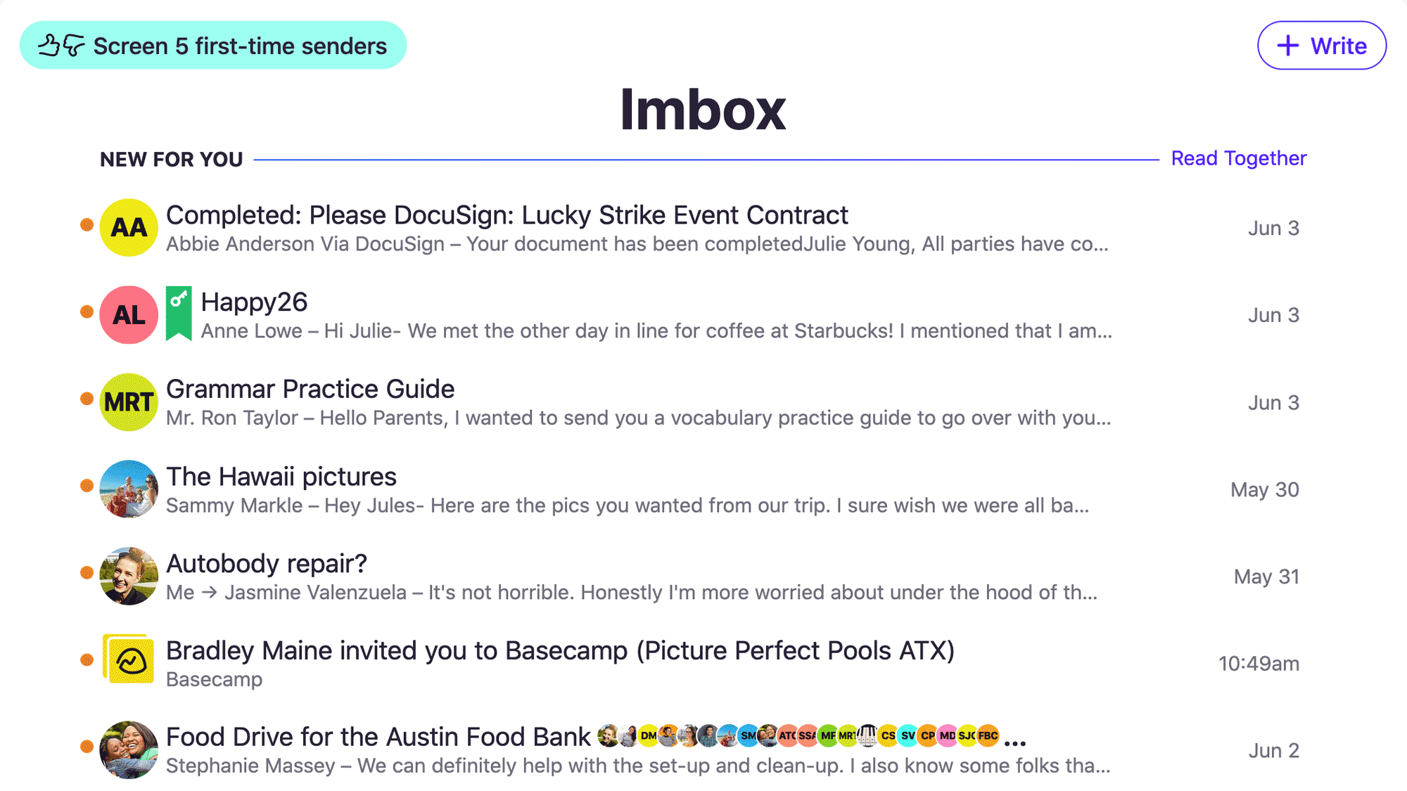
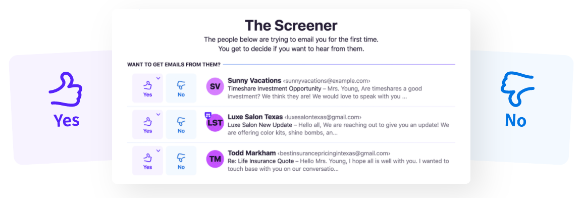
While email often feels like a chore, HEY makes efforts to inject a little enjoyment in the process. One example is the Screener function where you get to play the role of a virtual bouncer and dictate who gets into your inbox or not.

Self-Actualization
Another big theme with HEY centers around control — determining what messages get in, deciding when to reply, maintaining ownership of your data. Collectively, it means users run their email account rather than feeling overrun by it.
To implement this process with your own brand, select the elements that are relevant to your audience (click here to view all the elements) and then think about how your offering delivers on those elements.
Look for opportunities to deliver value on functional, emotional, and aspirational levels to hit on surface level problems as well as the areas that drive deeper customer needs.
Can A Brand’s Point Of View Get Too Sharp?

While a point of view is critical for a brand to break through it has to align with what your customers want in order to be effective.
While HEY does a great job articulating and following through on a sharp point of view, there are a few places where that sharpness could create some painful pokes.
- Preset Buckets: HEY pushes users to slot emails into either the “Paper Trail” for administrative emails, “The Feed” for newsletters and marketing emails, and the “Imbox” for important emails you want to see up front. The concept is sound, but can feel rigid when you’re used to traditional, arguably overly-flexible, email systems.
- Hyper Security: Hey forces customers to use Two Factor Authentication. This means you have to login with both a password and a code from a second device like your phone. The sentiment around security is great, but it can be a hassle and comes across a bit like over-parenting.
- Big Fonts, Big Space: While the open feeling of the design gives room to breathe, some of the giant font uses and whitespace reduce the visible space for quickly scanning lists of messages.
- Idea Overload: Because there are a lot of new ideas and conventions that get thrown at you at once, HEY can feel a little cumbersome out of the gate. That extra cognitive load can detract from the ease of use being promised.
Overall, HEY is walking an interesting balance between a message of giving back control to users, while also imposing lots of structure. As HEY gets more feedback and analyzes engagement, it will be interesting to see how their point of view evolves and maybe adds flexibility in certain areas.
Personally, I subscribed to their service not strictly for what the app does today but for where I see it headed. No doubt, that’s an emotional driver as much as it is logical.
Double Down On Your Brand’s Point Of View

When it comes to your brand, the big takeaways are:
- Your brand needs to craft a sharp point of view
- Satisfying emotional needs will help to build loyal customer relationships
- Your point of view can and should evolve with customer feedback
With a point of view as strong and detailed as HEY, it’s bound to appeal more to some people than to others. And like any new product, it needs customer feedback to help shape and mold its form.
But if a new product is going to lean in a direction, it’s much better to hedge towards the side of an overly strong point of view than a weak one.
The job of your brand’s point of view is to help customers decide whether they’re interested in what your brand provides. When a point of view is weak or dull, customers won’t even understand what you do in order to make a decision.
So, if you’re ever concerned about coming across too strong with your point of view, remember that it’s always better to attract some people and turn off others, than to be ignored by everyone.

Get Help Crafting A Sharp Brand Point Of View
If you’re ready to build stronger connections with your customers, reach out for a free consultation. We’ll help you transform your best business thinking into an actionable, shareable, growth-oriented guide. Click below to learn more about the Brand Guidebook process.

