When it comes to the key marketing messages for your brand, there’s one idea that we come back to more than any other. We write about it, we’ve done a research study about it, and we implement it with our clients.
Don’t just describe the features of what you provide, talk about the benefits.
In our study, we saw that 99% of the highest performing brands used benefit-focused headlines. Conversely, with the lowest performing brands only 35% focused on benefits. (You can download the full study for free here.)
In addition to the data though, there are lots of reasons to think in terms of benefits with your messaging:
- Connect your offering to the motivations and outcomes of your customers
- Reach customers on an emotional level, because that’s how most decisions are made
- Use language that’s more conversational and easier to understand
- Provide opportunities to express your brand’s Tone of Voice
- Help customers envision how their life can improve
- Do the mental heavy lifting for your customer instead of forcing them to digest features and come up with a reason why they’re important
This doesn’t mean that there’s no place for functional descriptions. In fact, the strategy we recommend (again, supported by our study) is to pair emotionally-driven benefit headlines with short descriptive subheadlines.
But the key is that the benefits and emotional connection come first.
To help highlight where these opportunities exist and how to implement them, here are three examples from companies we picked randomly off the web. Our criteria:
- Pick a variety of industries to show how this idea can apply in different situations
- Find businesses that focus their lead message on functional descriptions
With a cup of coffee in my hand as I write this, the coffee industry seemed like a good place to start.
Bones Coffee Company
Bones Coffee doesn’t make normal coffee. Their specialty is to infuse super specific flavor combinations into their beans to elevate your coffee experience.
Some of their more distinct flavors include Maple Bacon, Strawberry Cheesecake, and even Peanut Butter & Jelly.
Original Functional Version:
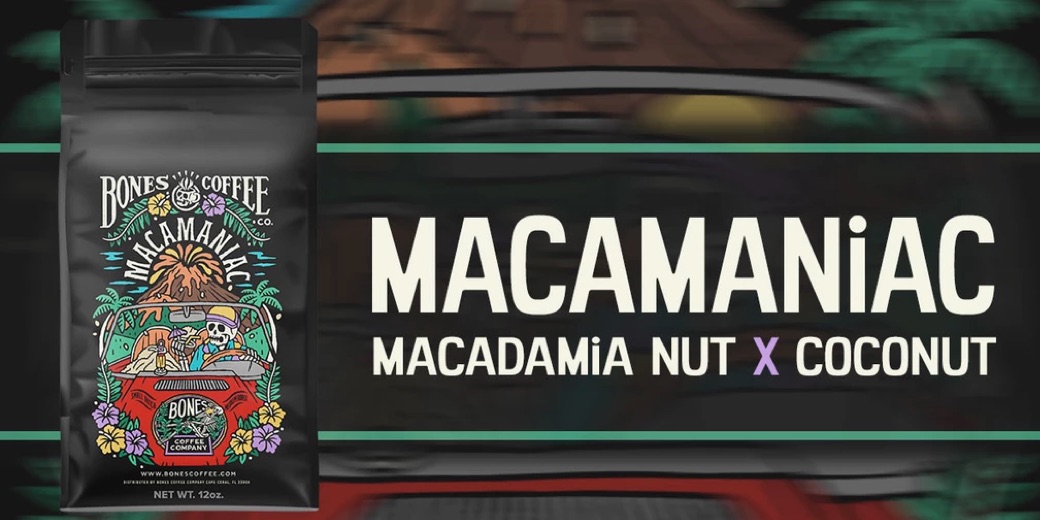
The current lead message on their site focuses on their Macamaniac flavor.
This is a classic messaging style we see on consumer packaged goods ecommerce sites:
- The name of the product
- A basic, functional description of the product
- An image of the product
It checks the box of saying what the product is but that’s about it. From a language perspective, there’s nothing evocative or interesting. Emphasizing the name “Macamaniac” is also a little confusing because it’s not a recognizable word, so at a glance it’s easy to scroll past.
This is a brand that clearly has a point of view with their name, imagery, and product line. They’ve invested a ton in creating fun, colorful, highly-detailed packaging for every one of their unique flavors.
But then the messaging comes up short.
Our Revised Benefit Messaging Version:
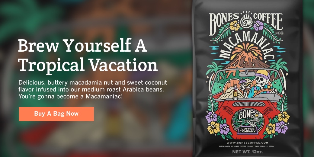
In our revised version, rather than stating the name of the product, we use a headline that teases at how this coffee makes you feel when you drink it. It creates a positive association between the product’s exotic flavors and providing a chance to relax.
We can then use Bones’ own product description as the subheadline to highlight the specific details of the flavors.
Finally, rather than simply making the entire image clickable as they do on the site, we add a visible call to action to purchase.
And note, this doesn’t even take advantage of the Bones Coffee skeleton brand theme. There’s so much untapped opportunity to inject fun, branded language around bones, skeletons, “taste to die for”, etc.
All of these elements together help create a more impactful and memorable experience. It puts customers in the mindset of what this coffee provides.
Joybird Custom Furniture
Joybird makes beautiful, hand-crafted furniture. Their mid-century modern styles and not-so-cheap prices all speak to this being a high-end brand.
Their furniture won’t be accessible for everyone, but for this level of quality it’s more within reach than uber expensive brands like Design Within Reach.
Original Functional Version:
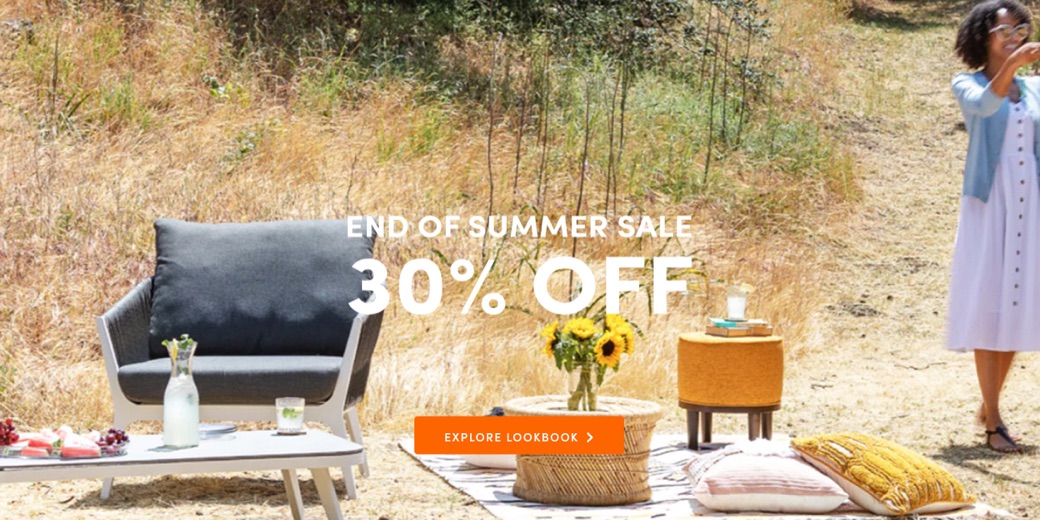
For a company that puts so much energy into crafting their products, their messaging gets very little love.
The furniture industry is notoriously focused around sales. Given how expensive an individual piece can be, it makes sense that discounts are key to attract customers.
However, even if you want to promote a sale, you can do better than plugging in a generic sale name and “30% Off” as the lead message on the site.
Everything else about the Joybird brand speaks to craftsmanship, quality, and beauty. Generic sales language undermines those things.
Looking at the Internet Wayback Machine, Joybird’s focus on basic sale language goes back many months. Their last several headlines were: “Friends and Family Sale”, “4th of July Sale”, “Semi-Annual Sale”, “Refresh Your Space Sale”, “Spring Sale”, etc.
Again, it’s understandable that customers are price conscious in this space but your brand should have something to say beyond that.
Maybe a less sales-heavy approach could be a way to differentiate themselves.
Our Revised Benefit Messaging Version:
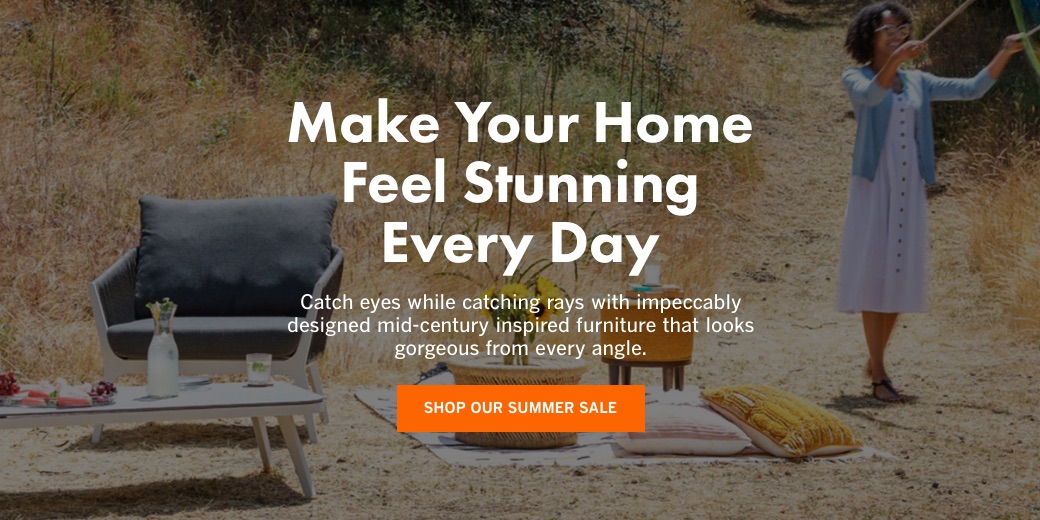
With our revisions, we switch the primary focus from “price-savings-only” to an idea that connects to a key value of the brand: beauty.
It also hints at the idea that furniture is an investment that pays daily returns. When you think about how much time we spend looking at and interacting with our furniture, it gets easier to justify spending a little extra. A nice chair, couch, or table can elevate both the aesthetic and comfort of your home every single day.
We also added in one of Joybird’s product descriptions in the subheadline to emphasize the specifics of the design and style.
Finally, the call-to-action is an opportunity to tease at the sale and drive customers to a featured selection of pieces.
Again, we don’t want to dismiss the importance of sales in this industry, but Joybird still has an opportunity to communicate at a higher level with their customers.
Country Living
In this last example, we have a totally different vertical. Country Living is a lifestyle magazine and website. Their content centers around themes like recipes, home decorating, and DIY craft projects.
Their tone is generally pretty casual and warm and their focus is primarily women. It’s the type of content that you can imagine being emailed between friends and shared on Facebook and Instagram (where they have 2 million+ followers!).
Original Functional Version:
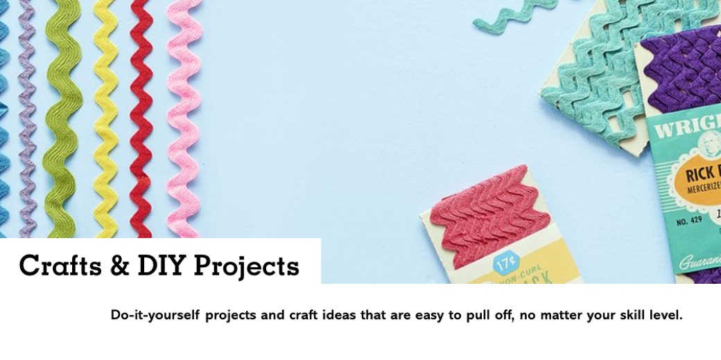
Despite the warm, friendly tone in their content, their messaging here is extremely generic. While it’s well optimized for SEO purposes, it doesn’t maximize the opportunity to enhance the relationship with their audience.
It’s important to take search engines into account, but they shouldn’t be your singular focus
Our Revised Benefit Messaging Version:
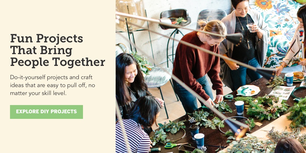
Our revisions go beyond a basic function and instead shift to what these projects can mean for people. Yes, it’s about having the final piece you create, but it’s also about the process of creating it.
DIY projects are a chance to express creativity and a chance to connect with family and friends in the process. Whether you take it super seriously or it’s just a one-off activity, crafts are a chance to do something fun and different.
It’s hard to say if this is the exact right benefit to focus on with Country Living’s audience. But the messaging and image are more engaging than the word “Crafts” and a photo of some rick rack trim material.
Explore and Test Benefit-Focused Messaging
Like any messaging changes, you should always experiment and test new ideas. The choices we made in these cases might not be optimal for each brand’s audience. The point is to show how brands can use messaging to highlight benefits and build emotional connections with their audience.
To get the most out of your brand and develop loyal customers you have to think beyond functional transactions. You can’t expect your customers to “just get it” on their own — especially when you only have their attention for a few seconds.
Take a look at your own marketing messages through the benefit-focused lens and see if you have some untapped opportunities.
Get Help Improving Your Messaging
If you’re ready to create stronger, benefit-focused messaging, reach out for a free consultation. We’ll help you transform your best business thinking into an actionable, shareable, growth-oriented guide. Click below to learn more about the Brand Guidebook process.

